


Project Information
Selling over 15 million pairs of sneakers annually, Olympikus is the largest sports brand in Brazil. Founded in 1975, the brand pioneered innovative technologies that transformed the industry, merging unmatched performance, comfort, and affordability.
In partnership with strategy and research consultancy Yöne, we identified that despite Olympikus' popularity in Brazil, the brand had opportunities to reach new audiences, to strengthen existing ones, and to expand into new categories including athleisure and higher-tier products. But in order to do so, there were a few challenges Olympikus had to overcome—from the lack of consistency in communication across its multiple channels, to relying less on price point as a driving message.
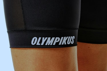
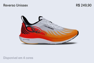
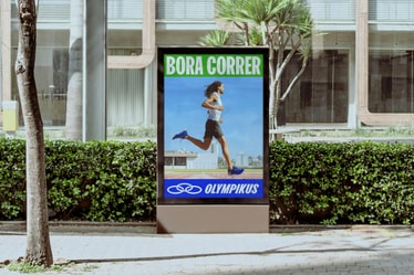
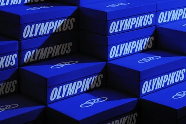
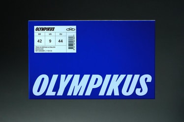
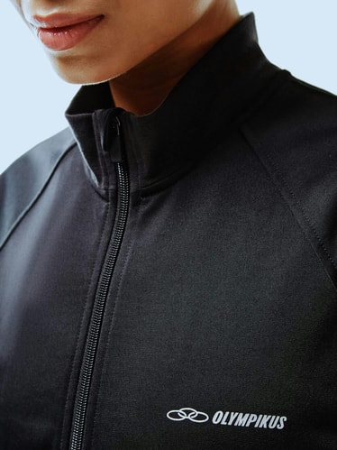
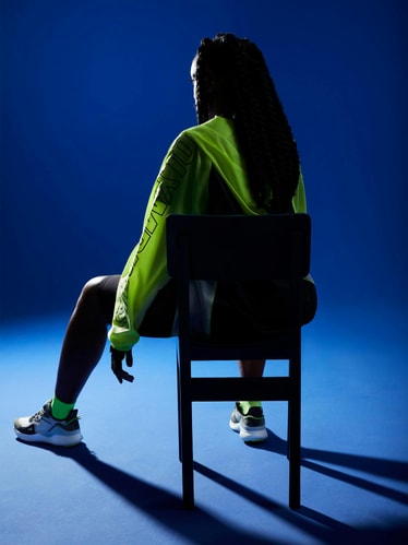
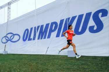
We started by carefully redesigning the brand’s core equities into the most confident versions of themselves. The italic type became more italic, the blue more blue, the bold wordmark even bolder. The result is a sharper and more deliberate visual language that leverages existing recognition while allowing the brand to scale in new ways.
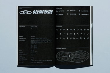
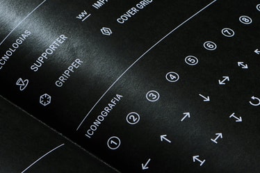
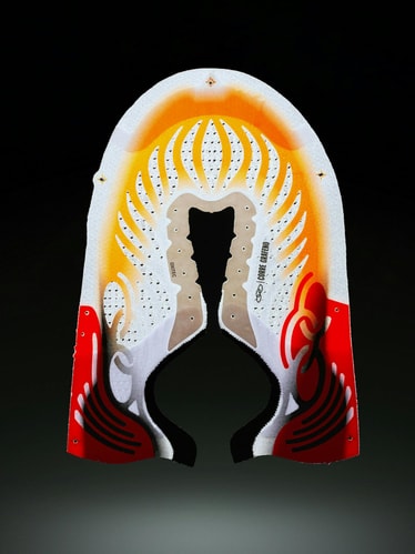
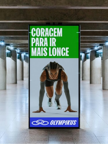
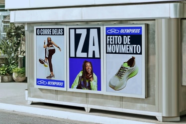
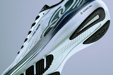
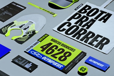
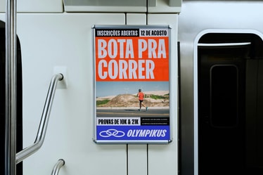
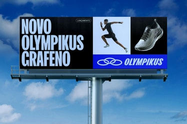
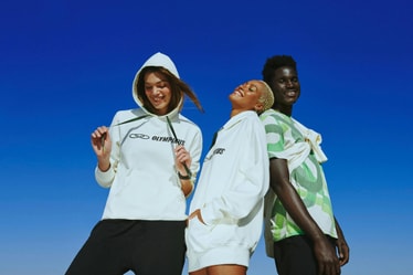
We also introduced a customized display typeface: FK Olympikus. The punchy, declarative font is complemented by a warm and approachable tone of voice along with a new line: "o tênis do corre", loosely translated to "the shoes for your hustle". In contrast, their proprietary technologies came to life through the use of technical illustrations, a monospaced typeface and a robust iconography library.
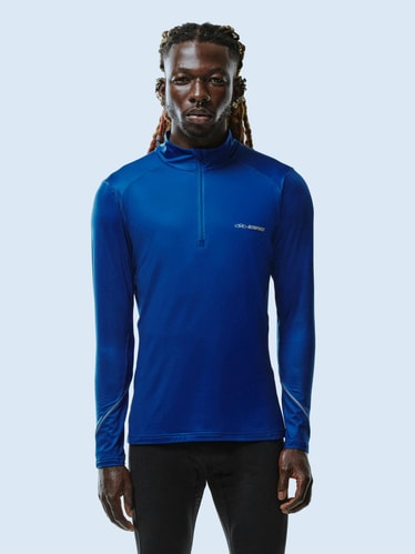
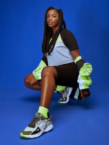
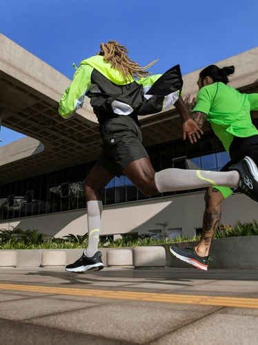
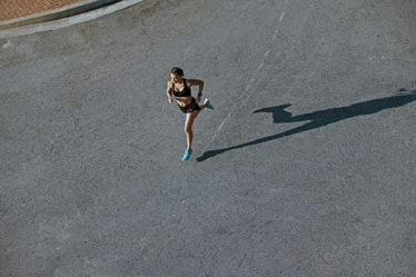
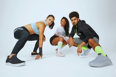
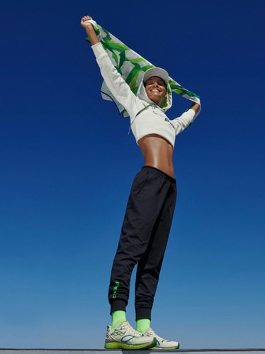
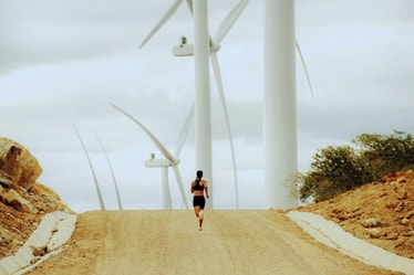
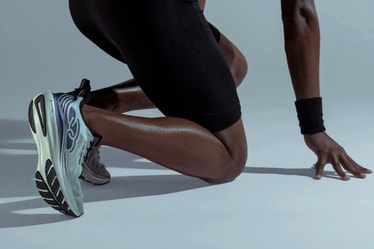
A comprehensive photography guide also helps merge the two sides of the brand, striking a balance between high performance and relatable everyday moments as well as the warmth of their Brazilian essence.
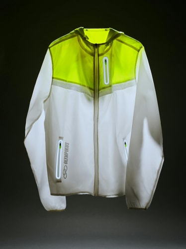
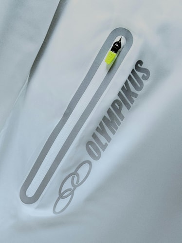
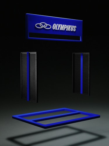
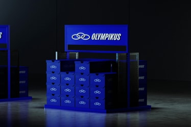
The identity comes together through a modular system inspired by the stripes and geometry typically found in running tracks and sports flags. The system is robust and flexible enough to adapt to all of the brand's touch points including retail, packaging, e-commerce, product and everything in between. The modules can rearrange in a myriad of formats to contain the different brand elements including imagery, video and illustration.
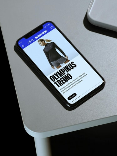
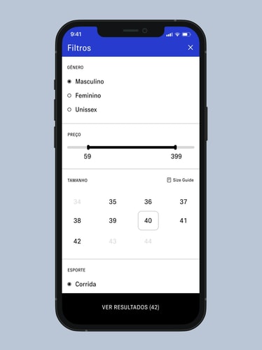
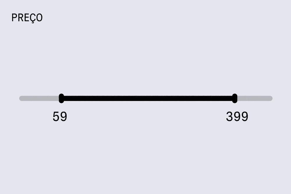
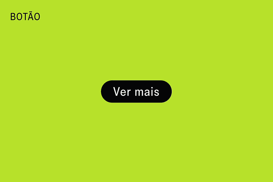
Currently under development, we worked closely with Olympikus to reimagine its entire e-commerce experience, making it more intuitive and easy to navigate while weaving in editorial and user generated content throughout.
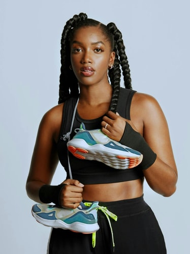
Since the rebrand, Olympikus has produced millions of sneakers with the new identity, became a 100% clean energy company, received the highest possible sustainability certification, hosted 3 Marathons, hired Brazilian superstar Iza as Creative Director and developed the first ever Graphene shoe. We can't wait to see what's next.
Credits
PORTO ROCHA
Creative Direction:
Leo Porto , Felipe Rocha
Design:
Martin Taylor, Fionn Breen, Maricruz Meza, Luis Vazquez, Leo Porto, Felipe Rocha
Motion Design:
Fionn Breen , Thales Muniz , Pedro Veneziano
Interactive Design:
Marcos Rodrigues , Martin Taylor
Project Management:
Nicholas Schröder , Elisa Bortolini
Tone of Voice & Copywriting:
Katiane Romero and Murilo Fonseca
Typography Design:
Florian Karsten
Campaign
Photography: Fred Othero
Artistic Creative Direction: Lisa Ho
Casting: Lisa Ho
Retouching: RG Imagem
Styling: Thais Barakat
Beauty: Bruna Pezzino
Product Photography:
Xico Buny, João Bertholini
Retouching: Rodolfo Pestana
Olympikus
Marcio Callage, Katia Ribeiro Buriol, Luciana Pires, Tamiris Lopes de Souza, Queli da Luz Forgiarini
Case Study
Case Study Photography:
Mari Juliano
Case Study Production:
Annie Carmichael
3D Design:
Vinicius Lavor , Pedro Veneziano
Strategy & Creative Consulting:
Yöne
Fonts
FK Olympikus by Florian Karsten
Signal by Production Type