
The Challenge
Despite its 26 billion monthly viewers, Vevo’s brand equity lagged behind its reach. Its logo was known primarily as a watermark on music videos and its perception was a distribution partner rather than the force powering the music video ecosystem. We needed to articulate its true role as a value driver for artists, fans, and advertisers.
The Solution
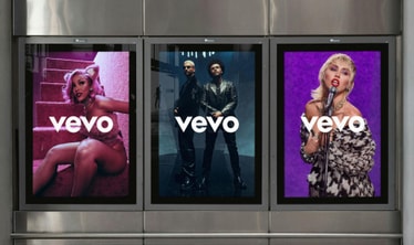
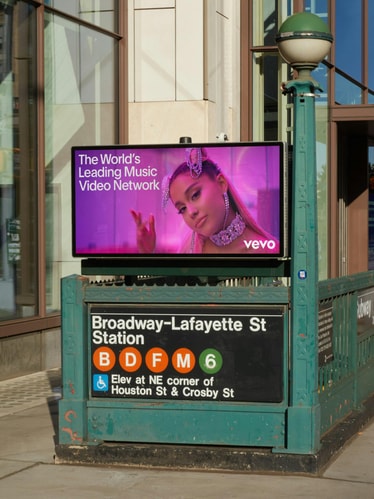
We repositioned Vevo as the world’s leading music video network, reorienting the brand’s architecture to match their authority. Anchored in amplification, the motion-driven identity system elevates artists while strengthening Vevo’s presence across every channel, giving them a wider range of expression to scale with artists, fans, and industry partners.
Project Information
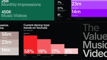
With a comprehensive library of over 500,000 videos and 26 billion views per month, Vevo is the world’s leading music video network. From the biggest music videos to up-and-coming artists and original content — Vevo provides 24/7 access to music videos across every screen.
Although Vevo has over a decade of industry expertise working with almost every major artist, our research revealed a clear challenge and opportunity: while Vevo’s wordmark is highly recognizable, there was less awareness around the breadth of Vevo as a brand. As a B2C and B2B company, Vevo also faced the question of how to communicate different messages across multiple audiences—from music fans to ad-drivers and the music industry.
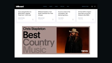
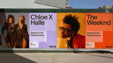
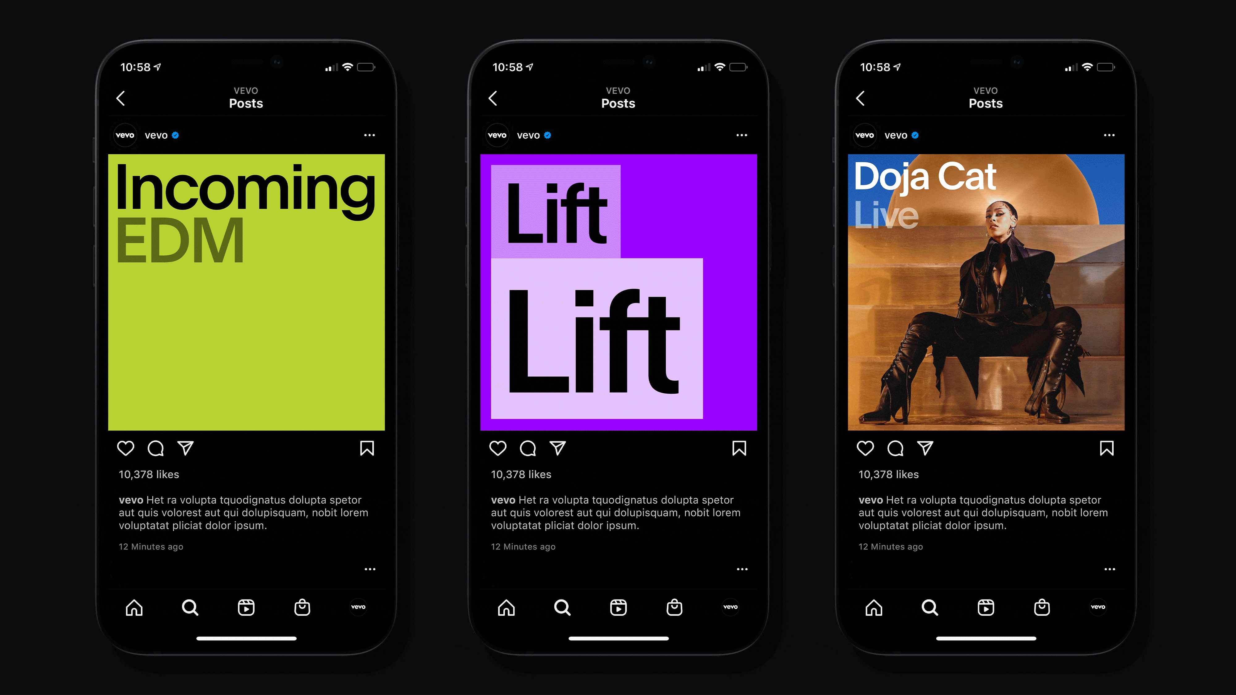
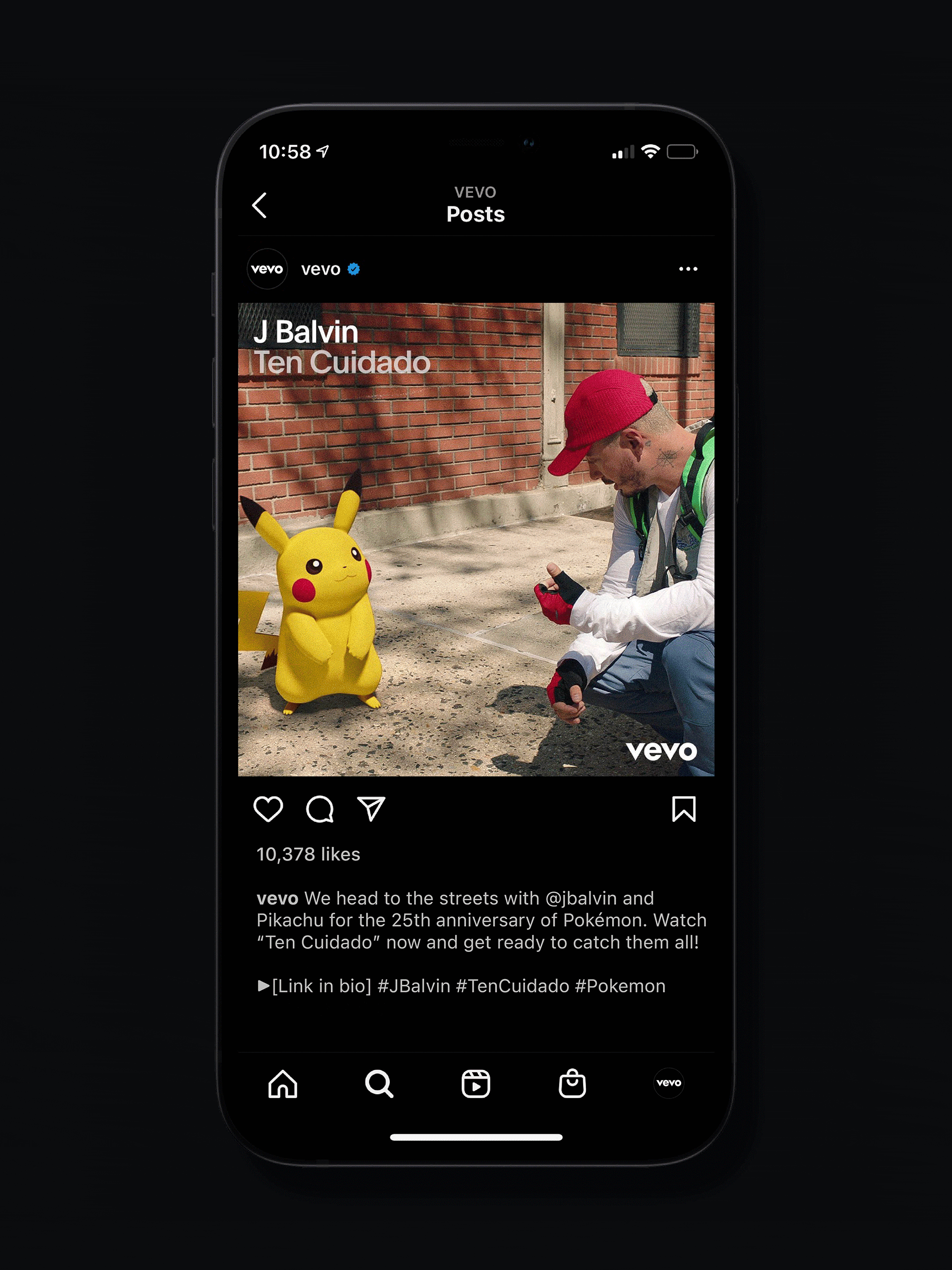
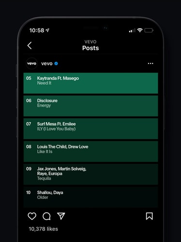
The new identity introduces brand elements that allow Vevo to expand beyond its classic watermark and into a more culturally-driven editorial space, helping to articulate their expert POV on music videos, backed by the numbers that only Vevo can claim. Through a dynamic, artist-centric design system, the brand is at the same time supportive and confident—balancing Vevo's brand presence with the artists and the work at the heart of the platform.
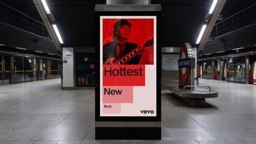
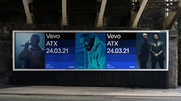
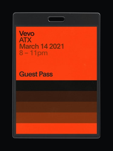
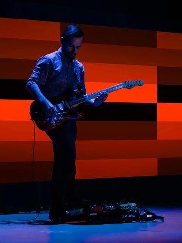
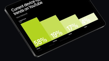
The layout system builds dynamic compositions that frame and champion an ever-expanding roster of content. Riffing on the core idea of amplification, Vevo’s new motion system becomes an ownable brand element in itself. A dynamic scaling approach leverages the modularity of layouts to present content with clarity while alluding to the vast library of music videos Vevo has to offer. Even in static applications, the spirit of the scaling-block movement plays a key role in delivering high-energy compositions.
Integral to the layout approach is a comprehensive system of secondary tones. These tints and shades of a flexible color palette support engaging information hierarchies, and at times serve as a shorthand for the many genres and subgenres within Vevo’s catalogue. Supporting the more expressive brand elements is a utilitarian sans serif typeface, Plain. Designed by François Rappo for the Swiss type foundry Optimo, it complements the geometry of the Vevo logo and provides a warmth associated with revivalist Grotesque typeface design.
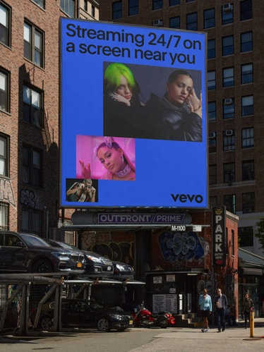
The modular graphic block system offers flexibility and cohesion. Adapting to support text, image, and video, it unifies Vevo's visual language and flexes across aspirational brand moments, business materials, and data visualization alike. A dynamic visual toolkit and polished brand voice allow Vevo to communicate with the confidence of an industry leader. The new identity not only amplifies artist expression but also extends an invitation into the exciting audiovisual worlds that only Vevo can offer.
Credits
PORTO ROCHA
Creative Direction:
Leo Porto
Felipe Rocha
Design:
Joseph Lebus
Fionn Breen
Motion Design & Video:
Fionn Breen
Project Management:
Nicholas Schröder
Claren Walker
Strategy:
Natalee Ranii-Dropcho
Bryan Wolff
Tone of Voice & Copywriting:
Natalee Ranii-Dropcho
3D Design:
Bruno Faiotto
Web Development:
Fluxo
Case Study Photography:
Sarah Hopp
Original Logo Design:
Violet Office
Vevo
Sydney Emery
Ed Walker
Dot Levine