
The Challenge
W Hotels once defined boutique luxury hospitality for the global jet set. But as travel shifted toward more nuanced, experience-led expectations, the brand’s identity began to feel dated and inconsistent across properties. The task: redefine luxury for today while preserving W's vibrant spirit.
The Solution
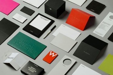
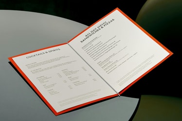
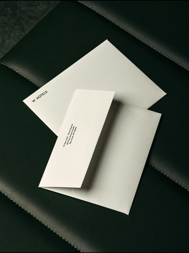
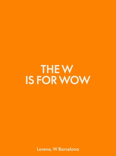
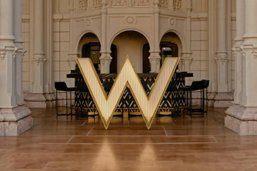
We repositioned W around a new platform: Luxury, Liberated. The identity refines the iconic W mark and introduces a custom global typeface, creating a more confident and cohesive system across markets. Bold yet subdued, the system flexes between attention-grabbing marketing and refined in-property design for a brand that is culturally relevant, globally scalable, and unmistakably W.
Project Information
Audacious, colorful, and unabashedly fun, W Hotels pioneered luxury hospitality for the creative set in the 2010s. But a decade later, luxury codes had shifted away from in-your-face opulence and toward the subtle flex, from photo-op to holistic experience. With a flock of competitors vying for traveler attention and the hotel’s expansion from single destination to global brand, W Hotels’ brand no longer had the pull it once did.
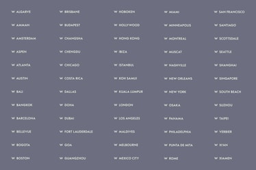
We teamed up with the hospitality icon to bring meaning back to the ‘W’, reinventing their identity to reflect a new brand position: Luxury, Liberated. We pushed beyond the old signals of aspiration to create a vibrant yet sophisticated system designed to scale. Balancing bold expression with intentional subtlety, the new brand translates across their 65+ global locations and unique property types including Resorts, Residences, and Urban Escapes.
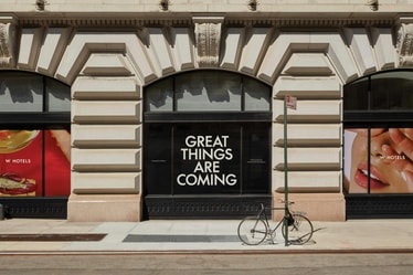
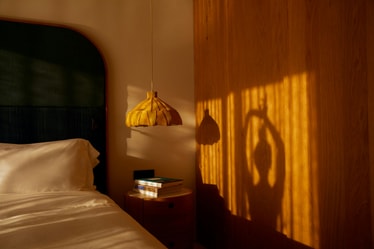
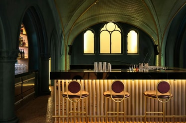
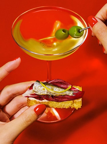
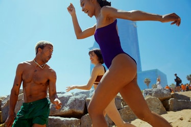
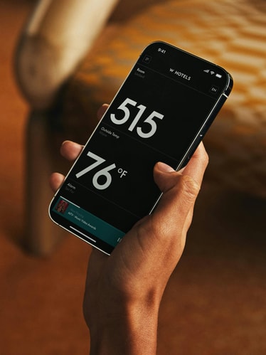
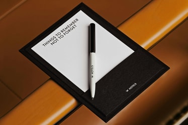
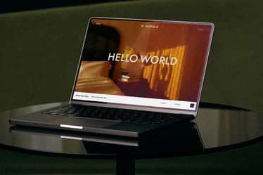
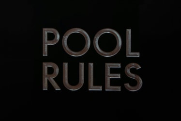
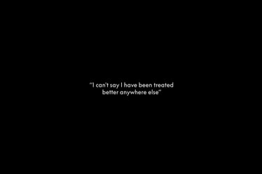
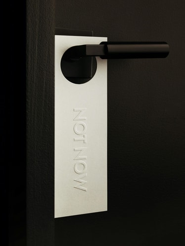
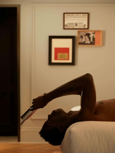
The system we created meets two distinct yet equally important communication objectives: to attract new guests through attention grabbing marketing, and then to enhance their stay once inside the hotel. For promotional moments, bold color, artful photography, large type, and declarative messaging come together to convey the vibrancy beyond the hotels’ doors. But once inside the property, the brand expression becomes more subtle with a neutral palette and an emphasis on tactile materials and finishes.
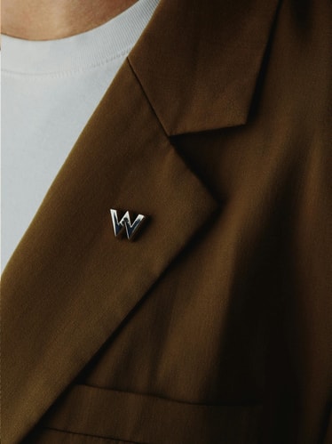
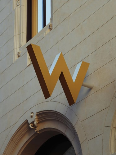
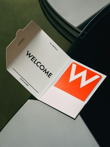
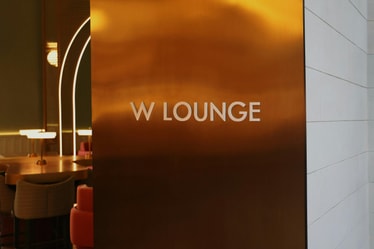
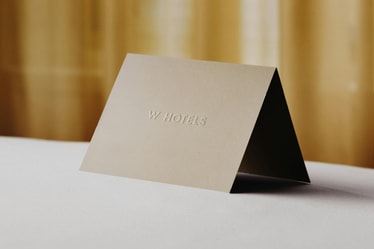
Preserving the iconic W symbol seen at the top of buildings worldwide, we then radically simplified the logo lockups, information hierarchy, and brand architecture. Opting for a single-sized wordmark integrated with the W symbol itself, we transformed the previous vertical lock-up with multiple fonts into a singular and impactful ‘W HOTELS.’ Akin to a fashion house logo, this approach imbues the brand with greater confidence and flexibility.
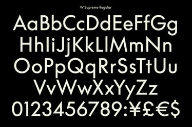
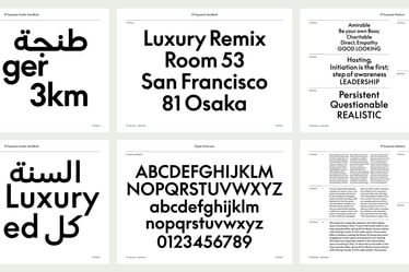
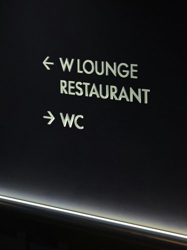
This exercise became the basis of a custom typeface developed in collaboration with Lineto that takes the geometric characteristics of the logo and extends them across each letterform. The result is W Supreme — a fully functional typeface that is both expressive and elegant. To ensure consistency across languages, we introduced a custom W Supreme Arabic script, as well as alternates in Mandarin and Japanese. The new typeface allows the brand to communicate in an understated yet uniquely W language, taking pressure off the logo as the only way to signal brand presence.
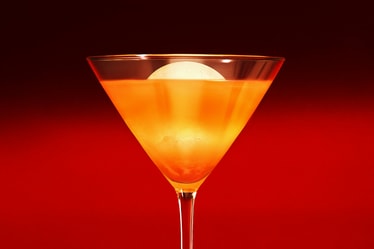
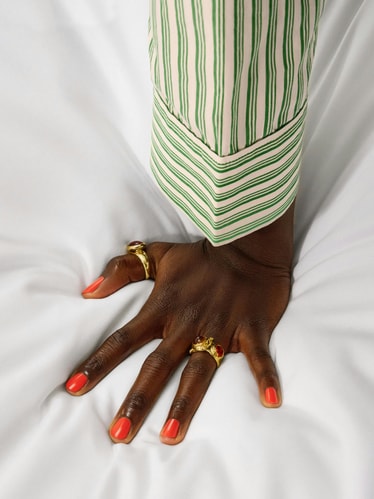
Color and imagery were key in signaling a new vision of luxury. We developed an extensive palette to replace the previous neons, maintaining their attitude while giving the brand a modern feel. Color combinations were defined for each location as well as an approach to lifestyle imagery that embraces local specificity (from white slopes for W Aspen to the famous boardwalk for W Barcelona). We tapped still-life photographer Sergiy Barchuk to create a suite of artful brand photography to be used across the entire system.
Since the rebrand, W Hotels has continued to grow: opening locations in Budapest and Edinburgh, partnering with new creators, and publishing over a dozen new content series using the system. Free from the constraints of luxury’s past, their refreshed identity now sets the tone for a liberated future.
Credits
PORTO ROCHA
Creative Direction:
Felipe Rocha , Leo Porto
Design:
Joseph Lebus , Natalia Oledzka , Eyal Chowers , David Klein
Interactive Design:
Marcos Rodrigues
Motion Design:
Thales Muniz
Brand Strategy & Tone of Voice:
Nathan Manou
Project Management:
Luciana Thiesen , Madeleine Golden
Account Director:
Luciana Thiesen
Operations Director:
Nicholas Schröder
W Hotels
Tom Jarrold, Benoit Racle, Carly Van Sickle, Kathryn Flexner, Rebecca Finell, Arax-Rae Van Buren, Christine Espinoza, David Menda
Photography
Still Life: Sergiy Barchuck
Lifestyle: Guillaume Roemaet
Video
Print Production
Riott Haus
Case Study Production
Design:
Joseph Lebus , Eyal Chowers , Marcos Rodrigues , Maya Flood
Motion Design:
Thales Muniz , Josh Krauth-Harding
Copy:
Claren Walker
Photoshoot Production:
Victoria Alba , Annie Carmichael
Photography:
Daniel Forero
Project Management:
Annie Carmichael , Luciana Thiesen
Fonts
W Supreme - Lineto
M Ying Hei HK, Monotype HK
Shorai Sans, Monotype