The challenge
Nike was the pioneer that brought running from the track to the masses. But as Nike expanded across verticals and challengers gained ground in running, a perception gap emerged in a category the Swoosh once dominated. Our mandate: reclaim Nike's position as the undisputed running brand.
The Solution
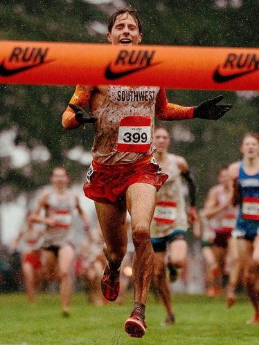
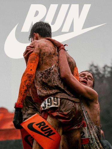
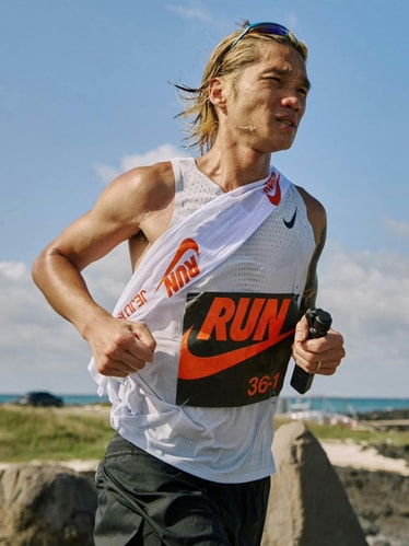
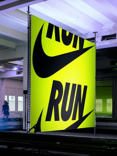
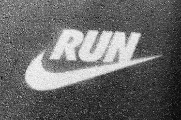
We recharged Nike Run by going back to its roots —harnessing a legacy to fuel the future. The system unifies Nike’s global running initiatives under a singular identity: a new RUNSWOOSH logo stands as an unmistakable signal and inspiring rallying cry, supported by declarative typography and voice. Unapologetic in tone, the identity cuts through the noise with focus and clarity, amplifying the emotions that drive runners forward.
Project Information
As the first to bring the running shoe to the masses, Nike’s history was something no other brand could claim. Since their 1971 release of the Nike Waffle Racer, Nike had expanded its empire from footwear to streetwear, ACG to Jordan. But with a rush of emerging players joining the race, they were starting to lag behind in the running category they had pioneered.
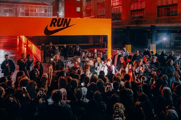
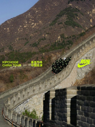
We were tasked with helping to make Nike the run brand once again through a robust identity specifically for their running line and initiatives. The system would impact everything from campaigns and marketing to retail, product, and global events. More than just a visual identity, the rebrand serves as a north star and a uniting platform for Nike teams and runners from all corners of the globe.
Our solution: harness legacy to fuel the future. Through a combination of strategy, visual identity, and voice, we recharged Nike Run by going back to their roots: running as the soul of Nike and Nike as the sole of running.
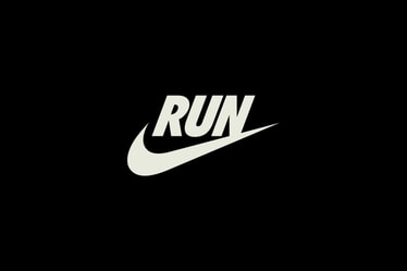
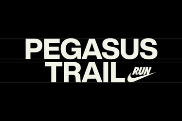
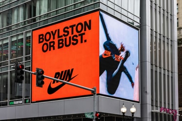
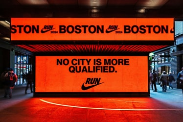
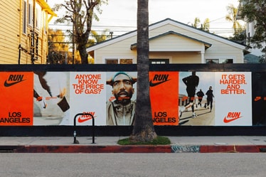
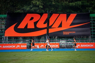
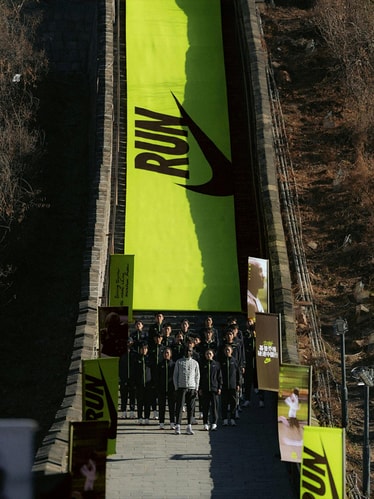
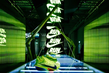
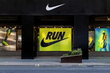
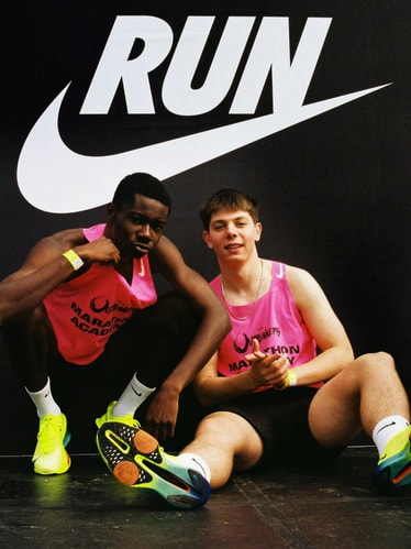
At the core of the identity is a new mark with a storied history: the RUNSWOOSH. Taking inspiration from an iconic Nike lockup dating back to the 1980s, we replaced the brand name in the original with a simple and declarative “RUN.” Referencing the past but oriented toward Nike’s future, the lockup is a bold call to action for the world to do just that.
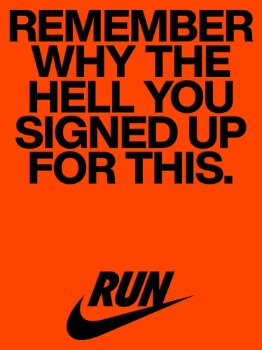
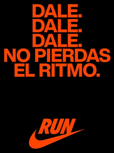
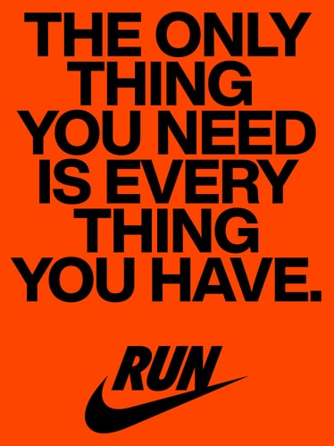
The audacity of this rallying cry echoes throughout the tone of voice: built to embody the rebellion from Nike’s roots and the devotion to the relationship that is running. Balancing the poetry of a love for the running highs with the protest of pushing even one more mile, the voice lights a fire within the runner in all of us.
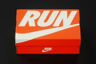
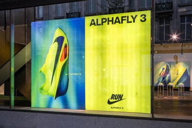
The color strategy also draws on Nike’s origins. Volt Orange is hero in the palette, a reference to the iconic orange shoe box that’s been a calling card for the brand since Phil Knight envisioned it in 1972. A contemporary neon (Volt Yellow) drawn from Nike Running Club, adds greater flexibility and vibrancy to the palette.
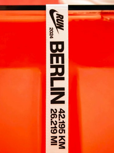
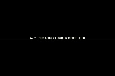
Helvetica Now became the core typeface: a utilitarian font that allows us to rise to the level of protagonist or act as a supportive signature. Its tone can be confident and declarative, or technical and precise, always adapting to various contexts and needs as the brand moves along the emotional spectrum of running.
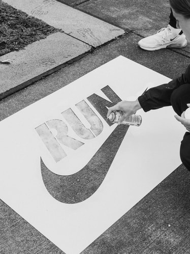
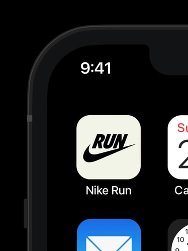
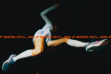
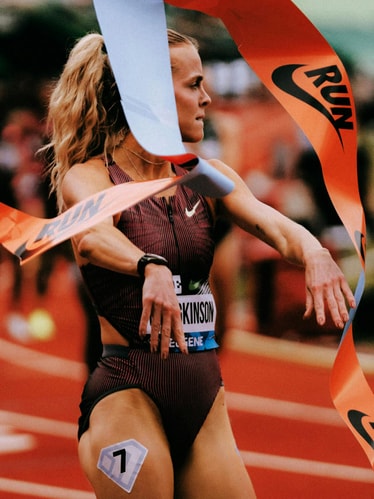
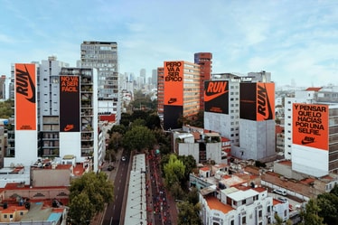
Employing a modular layout system was critical for a brand that would be activated across thousands of global touchpoints: from marathon events to product takeovers in store. As a whole, the system allows Nike Run to move with ease from precise, technical executions to more expressive, brand-forward moments. Running is inherently in motion, and so is our system.
With logo, type, and color as powerful anchor points, the new Nike Run identity creates impact in any context – from São Paulo to Seoul, Los Angeles to London, Boston to Berlin. Coming to life across the world, the brand system has kickstarted Nike’s journey back to the top of the running category.
PORTO ROCHA
Creative Direction:
Felipe Rocha , Leo Porto
Design:
Joseph Lebus , Nathan Fyock , Yedo Han
Motion Design:
Thales Muniz , Josh Krauth-Harding
Interactive Design:
Marcos Rodrigues , Giovana Yahiro , Niclas Resch
Strategy & Copywriting:
Natalee Ranii-Dropcho , Ayo Fagbemi
Project Management:
Hamilton Yu
Account Director:
Luciana Thiesen
Operations Director:
Nicholas Schröder
Nike
Shannon Ross-Williams, Nick Parkinson, Katie Price, Mason Houck, Tori Matthews, Tim Cheng, Grant Smith, Gabe Folick
Creative Agencies
Wieden+Kennedy
Mutant™
Bravo. Charlie. Mike. Hotel
Soursop
Sunst Studio
Hovercraft Studio
Photographers
Xenia Alexandra
Julio Nery
Daniela K. Monteiro
Angela Djekic
Rory Griffin
Boogie
Cortney White
Yannic Schuster
Jack Bool
Timothy Eliot Spurr
Max Manavi-Huber
Ethan Byrne
Magnus Pettersson
Cameron Strand
Kris Cantrell
Andrew Tung Borlongan
Handover
Fonts
Helvetica Now
Monotype
