
Project Information
ℓiⱴε is an independent agency in Brazil with over 13 years of experience cultivating unique connections between people and brands. Committed to creating work that blurs the boundaries between the physical and the digital, ℓiⱴε can be described as a humanistic “post-digital agency”, striving toward conscious advertising in an age of overwhelming content and misinformation. By working closely with the ℓiⱴε team, we crafted an entirely new brand identity and communication strategy that marks the next chapter in the agency’s life and strengthens their position to both clients and the industry.
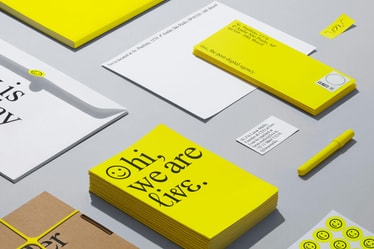
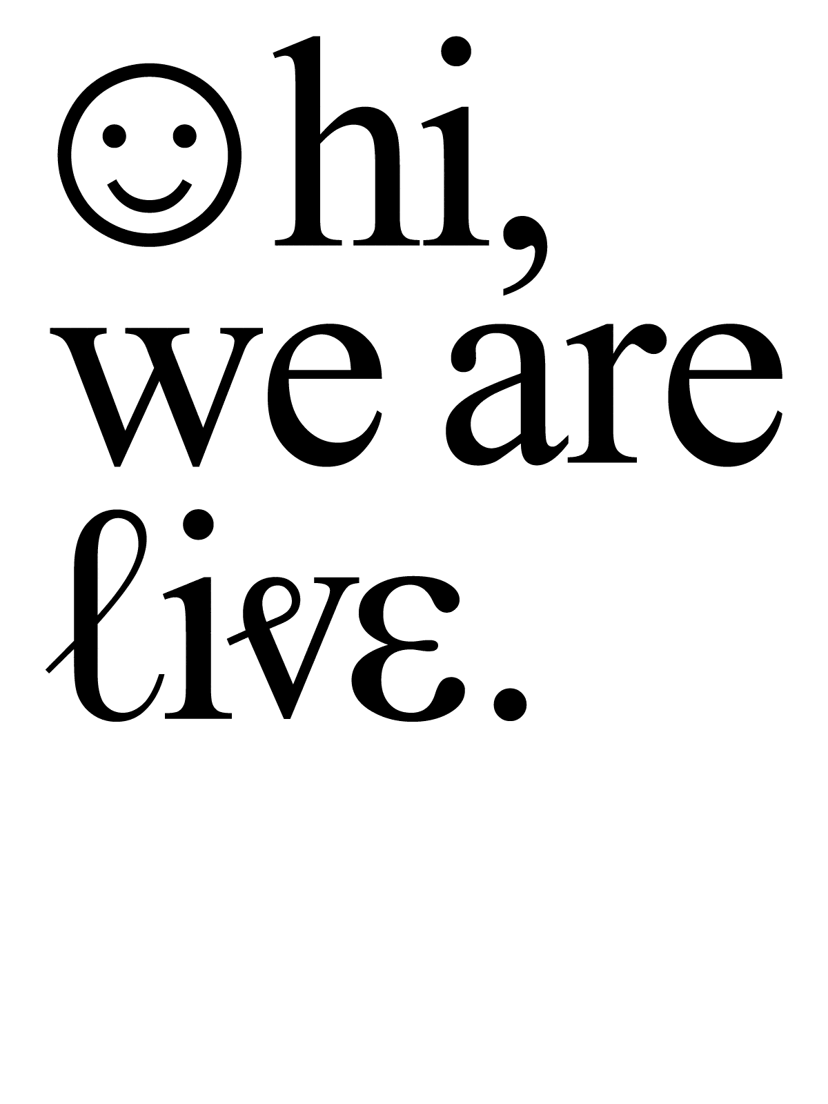
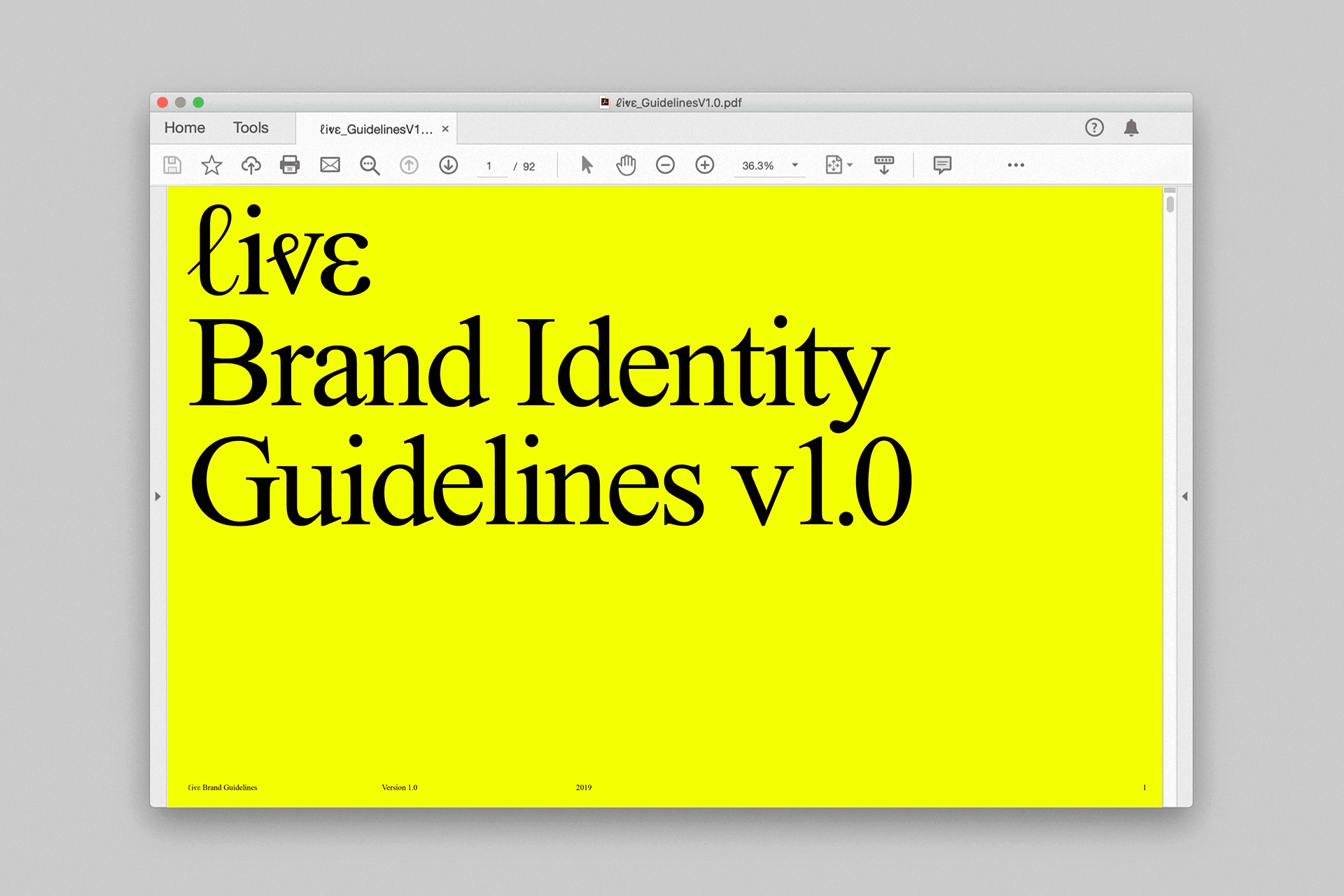
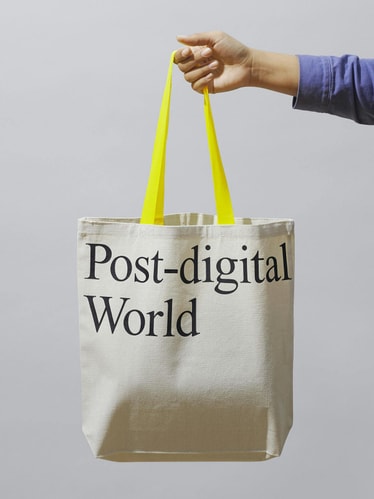
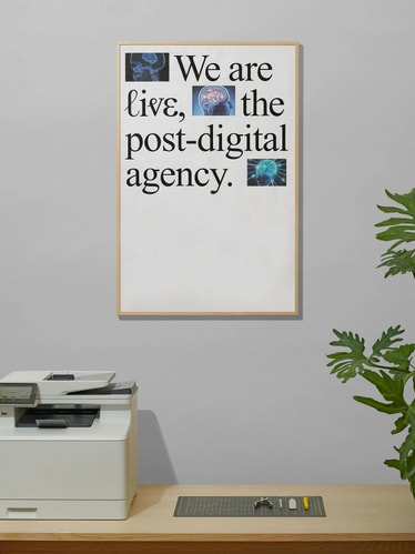
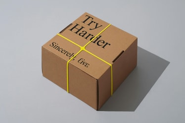
Through a straightforward type-centric approach, Times New Roman plays a key role in the identity. It not only defines ℓiⱴε’s conversational tone of voice, but further signals a broader act of defiance, stripping away superfluous layers of decoration to reveal the brand at its core. With a heritage that harks back to 1932, Times New Roman was the first font licensed for all computers, cementing its status as the world's most ubiquitous and democratic typeface. This pared back typographic language was designed to convey ℓiⱴε’s clarity and directness, allowing their work and messaging to shine for itself.
The new logo was created from a selection of different glyphs from Times New Roman, resulting in a unique and open-source wordmark that is universally accessible from all types of devices and digital platforms. Since it is composed of editable text, the logo can be inserted, copied and replicated by anyone though any text application, like this: ℓiⱴε.
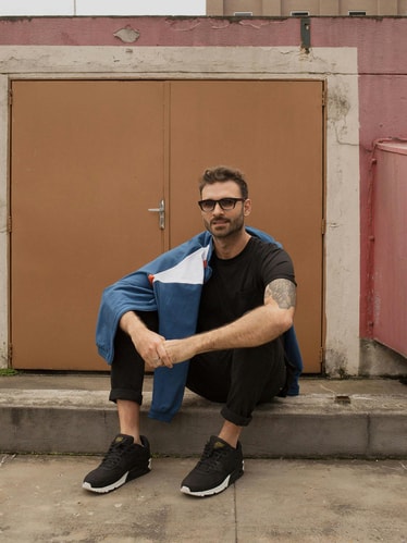
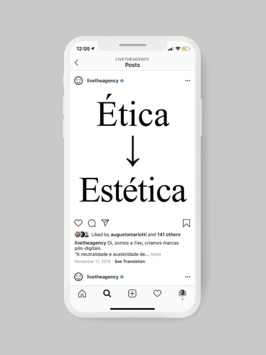
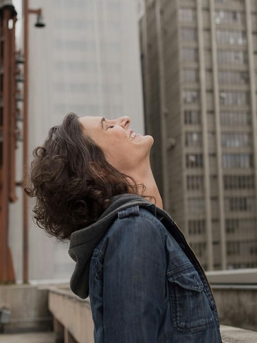
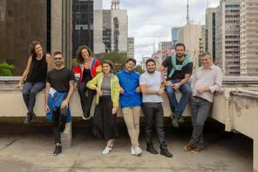
We were also tasked with redesigning ℓiⱴε’s website from the ground up. Set entirely in Times New Roman and incorporating an abundant use of white space, the site serves as a blank canvas; a vessel to showcase their work in its clearest form. To introduce the different individuals that make up ℓiⱴε, we commissioned Coletivo Amapoa, a photography collective from São Paulo to create a series of candid, unfiltered portraits of the team in both their workspaces and different neighborhoods across the city, encapsulating their individual perspectives. The website also functions as an open space to share new ideas through a journal called [“feeed”](https://live.tt/en/feeed/). Here ℓiⱴε releases self-initiated content and industry updates, further establishing their receptive approach and tone of voice.
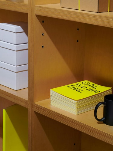
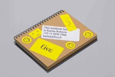
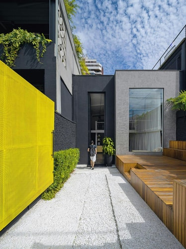
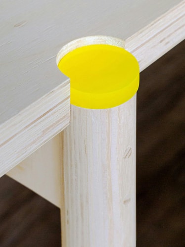
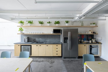
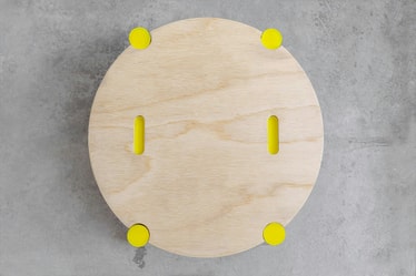
Along with ℓiⱴε’s radiant yellow, we created a material palette comprised of raw surfaces and quotidian materials that work together to add warmth to the identity while conveying the honest, optimistic nature of the brand. Brought to life by architect Guto Requena, the workspace features custom furniture that contrasts Paricá plywood with bright yellow rubber finishes embossed with ℓiⱴε’s secondary symbol (☺).
Since its launch, ℓiⱴε’s new design system has been implemented across each one of its environments — from digital communications down to the furniture's finest details. By carving out space for honest dialogue and critical conversation, ℓiⱴε’s new identity repositions the agency to clients and the creative community while adapting to the rapid changes that are occurring within the industry both today and tomorrow.
Credits
Design:
Felipe Rocha , Leo Porto
Website Development:
Luego
Photography:
Coletivo Amapoa
Industrial Design:
Guto Requena
Design Production:
Maricruz Meza
Case Study Photography:
Mari Juliano , Manuel Sá , Julio Nery
Fonts
Times New Roman