
Project Information
Just a few years ago, building Web3 apps on Bitcoin was almost unthinkable. It’s the original blockchain, but its reputation was stuck in the ‘coin’. Enter Hiro, a suite of open-source developer tools that empowers developers to put Bitcoin to use.
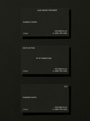
As the #1 tooling company in the Stacks ecosystem, Hiro needed a brand that would align with their mission and reflect their growth as a company, all while staying true to their developer roots. Departing from the clichés of their crowded crypto landscape, we developed an identity that brings a new visual language to Web3, balancing technical precision and a subversive sensibility.
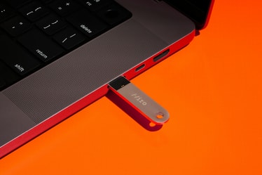
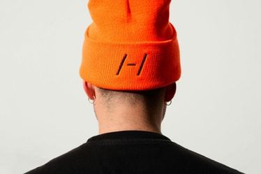
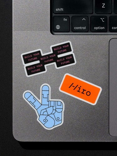
At its core is a logo inspired by the humble command-line: a technical mono wordmark with a unique /-/ that serves as an ownable icon for Hiro. Constructed from two forward-slashes and a dash, this sharp yet simple gesture signifies forward momentum. And because anyone can type it out, the mark is fundamentally open-source — just like Hiro’s tools.
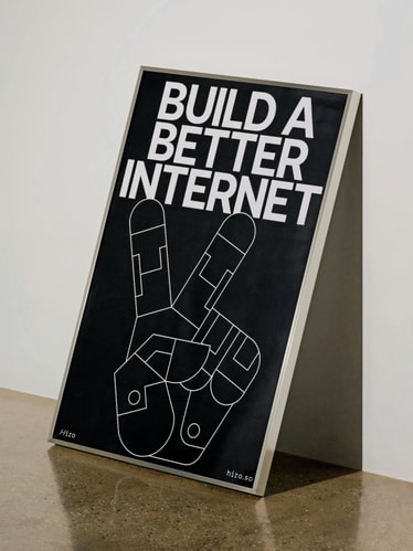
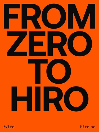
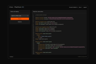
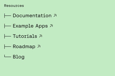
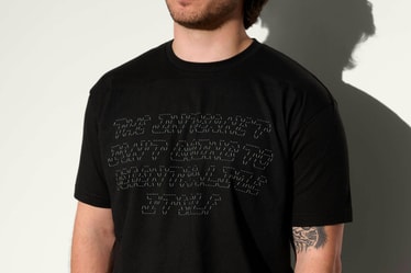
Headlines in Aeonik Bold articulate ambitions with confidence, while Aeonik Fono (its digital-friendly mono cut) works hard across technical touchpoints, from body copy and web components all the way to developer documentation. Hiro’s new graphic language recontextualizes ASCII images to provide flexibility and expand the system in line with the typed-out logo mark.
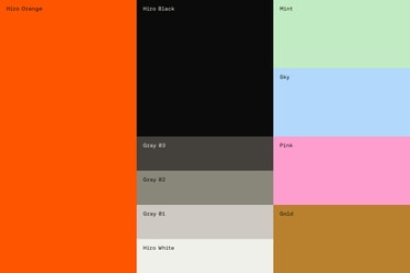
As a gesture to Bitcoin, vibrant orange is at the center of the color strategy, complemented by a secondary palette that references the analog pastels of early computing punched cards. In the crowded space of Web3 startups, the identity establishes Hiro as a new kind of protagonist: sharp, courageous, and a bit unexpected.
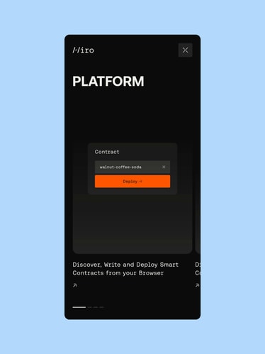
Since the identity’s launch last year, Hiro has only gained more momentum: over 2,000 Web3 developers have signed up for the Platform waitlist and they’ve seen record-highs for new database subscribers, surpassed each quarter.
Credits
PORTO ROCHA
Creative Direction:
Felipe Rocha , Leo Porto
Design:
Nathan Fyock , Eyal Chowers
Motion Design:
Thales Muniz
Interactive Design:
Marcos Rodrigues , Heena Chung , Niclas Resch
Strategy:
Claren Walker
Account Direction:
Luciana Thiesen
Project Manager:
Samantha Cruz
Hiro
CEO at Hiro Systems
Alex Miller
CTO at Hiro Systems
Diwaker Gupta
VP of Marketing at Hiro Systems
Kaitlin Pike
Visual + Brand Designer:
Eugenia Digon
Platform Development:
MAD
Case Study Production
Motion Design:
Josh Krauth-Harding
Design:
Nathan Fyock, Yedo Han
Interactive Design:
Marcos Rodrigues , Niclas Resch
Photographer:
Mari Juliano
Photoshoot Production:
Annie Carmichael
Photo Retouching:
Rodolfo Mello
Fonts
Aeonik Mono by CoType Foundry
Aeonik Fono by CoType Foundry
Aeonik Bold by CoType Foundry
