


Project Information
QuintoAndar became the largest housing platform in Latin America by revolutionizing how people find and move into new homes, whether renting or buying. Simplifying the often painful real estate process by connecting tenants and those interested to property owners, the intuitive platform paved the way to more efficient, transparent real estate transactions in an otherwise bureaucratic industry.
As QuintoAndar grew and evolved, so did their vision for their platform and its impact in the housing segment. To help craft a brand that could reflect those intentions and prepare the company for the next stage of evolution, PORTO ROCHA was invited to develop an identity that reflected the company's purpose and greater focus around the meaningful relationships between people, their homes, and their wellbeing. The project involved an intense co-creation process with QuintoAndar’s branding and creative teams.
The rebrand presented two opportunities ahead. On a practical level, QuintoAndar needed a robust identity that could scale and support its ambition for global expansion. But there was also a clear opportunity to balance their pragmatic, problem-solving DNA with a less-explored side of the brand: the emotional connections, diverse stories and intimate relationships people have with their homes.
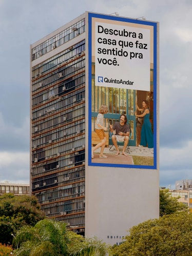
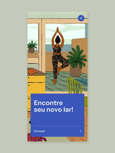
Answering the needs for both scalability and human warmth, PORTO ROCHA developed a flexible system inspired by the idea of frames. This simple visual device has an emotional tenor: whether it’s a favorite view through a window, or a family photo on the wall, frames call to mind the most personal parts of our spaces. Used as a motif in dynamic layouts and in motion, these framing devices expand, contract and overlap, bringing together photography, video and typography that celebrate a multitude of stories and perspectives.
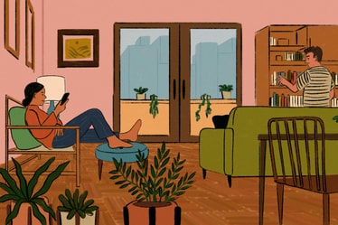
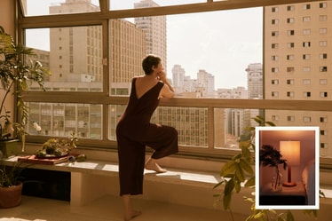
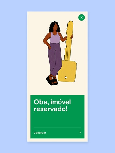
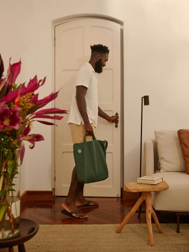
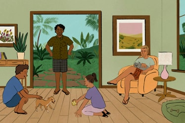
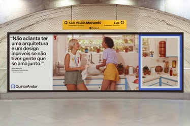
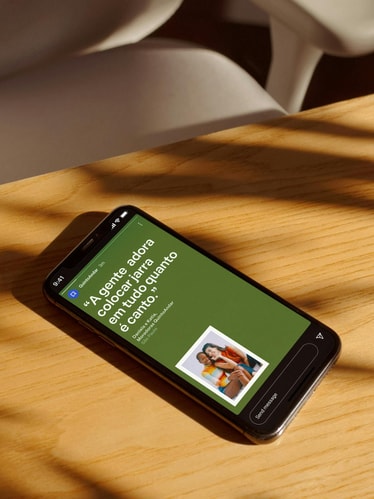
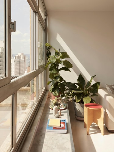
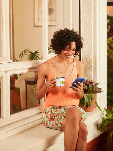
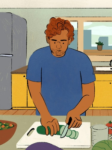
Shot by Lorena Dini, the warm, immersive photography transports us to uniquely expressive homes and the stories behind them. From small details to wide angle shots, the new photography direction captures residences and their dwellers in a way that is intimate and unrehearsed. Focused on real and relatable people, this approach to photography helps reveal how people’s homes can become an extension of themselves. Additionally, illustrations by Haley Tippmann and Rafaela Pascotto bring a textural and analog quality to the identity, coming to life both in product and other communication touchpoints. This gestural style shows domestic spaces in a more personal light, setting an unexpected creative tone for the digital platform.
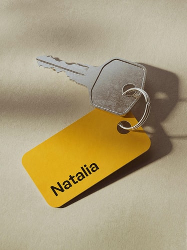
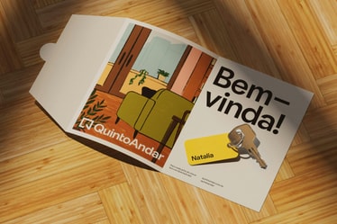
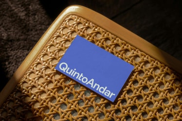
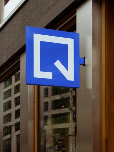
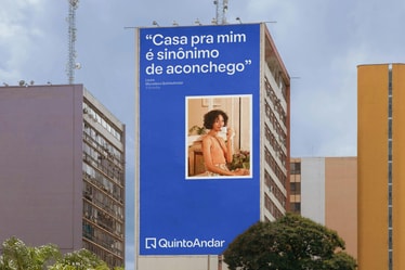
A new symbol for the brand references the 'Q' in QuintoAndar with the geometric precision of a floor plan. Alluding to an open door, the mark extends a welcoming invitation into the different spaces and connections the platform makes possible.
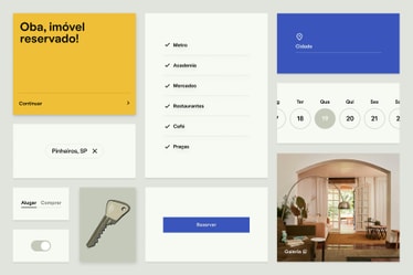
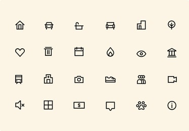
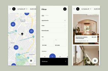
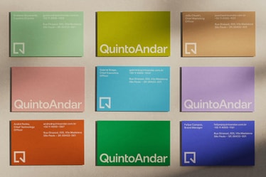
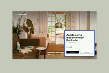
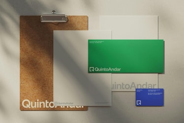
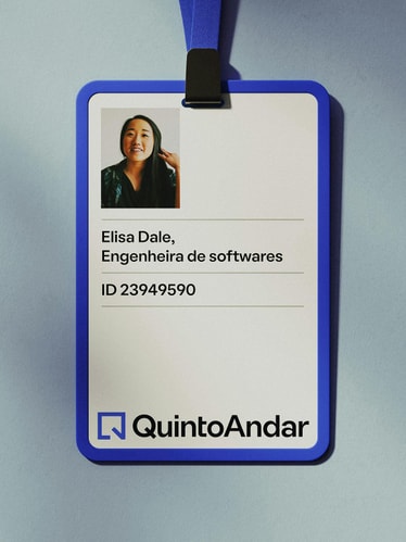
While preserving the equity in QuintoAndar’s blue, an expanded color palette offers greater possibilities for expression across a growing range of touchpoints. The extended palette enables the brand to better communicate diverse stories: the various tones can complement and support the different perspectives of the residents that QuintoAndar serves. In contrast to the expressive sensibility of the new palette and illustrations, a precise, comprehensive iconography library was developed to support ease of navigation on the app and clear information hierarchy.
The sense of openness and empathy found throughout the identity speaks to QuintoAndar's continued mission to solve people's problems and headaches while looking for a new dream house. More than simply a property tech company, QuintoAndar’s proposition is one of connection between all of those involved in the process of finding a new place to live, from owners to tenants, buyers, real estate agents, real estate companies and so on. . Aligning the company’s visual identity with their human-centered mission, the new brand opens the door for QuintoAndar to grow into new markets, poised to help even more people find home.
Credits
Creative Direction:
Leo Porto , Felipe Rocha
Design:
Natalia Oledzka , Marcos Rodrigues , Lucas Machado
Motion Design & Video:
Thales Muniz , Young Woo , Duncan Brazzil
Animation:
Giordano Caldas
Project Management:
Nicholas Schröder , Elisa Bortolini
Illustration:
Haley Tippmann , Rafaela Pascotto
3D Design:
Bruno Faiotto
Strategy Consultancy:
Matheus Dick Lee , Gustavo Bonfiglioli
Web Development:
Fluxo
Brand Photography:
Lorena Dini
Filmmaker:
Natacha Mantovani
Case Study Photography:
Yasmin Velloso
QuintoAndar
CEO: Gabriel Braga
CTO: André Penha
CMO: João Chueiri
Creative Director: Gustavo de Lacerda
Creative Managers: Allan Sena, Mauricio Bina
Brand Director: Flávia Mussalem
Brand Managers: Felipe Campos, Stefano Arpassy
Head of Marketing Communications: Daniela Ryfer
Senior Designer Manager: Leandro Novaes
Principal Product Designers: Egon Toegel, Cristiano Luís Silva
Principal Content Designer: Lidiana Domingues
Brand Manifesto Film
Agency: In House Quinto Andar
Production House: Barry Company
Direction: Breno Moreira and Jesus Mendes
Executive Production: Krysse Mello and Ana Flavia Di Luca
Director of Photography: Bernardo Negri
Art Direction: Clara Letícia Mol de Sousa
Filmmaker: Natacha Mantovani
Project Manager: Carolina Teixeira; Second Unit Director: Jesus Mendes; Breno Moreira and Jesus Mendes; Production Coordinator: Aline Ara; Production Coordination Assistant: Daiana Müller; Post Coordinator: Ale Cois; Post Coordination Assistant: Sabrina Comar; Post-production: Barry Company; Finisher: Luiz Bicudo Jr.; Editor: Bruno Alves; Color Grading: Breno Moreira / Bruno Alves; Producer: Raw Audio; Musical Production: Fernando Forni, Ricardo Pinda and Rogerinho Pereira; Musical Direction: Hilton Raw; Sound Design and Mixing: Enrico Maccio and Philip Braunstein; Customer Service: Carol Peternelli; Coordinator: Robério Barbosa; Announcer: Heaven; Advertiser: QuintoAndar; CMO: Joao Chueiri; Creative Director: Gustavo de Lacerda; Brand Director: Flavia Mussalem; Creative Manager: Mauricio Bina, Allan Sena; Copywriter: Thais Boaventura; Art Director: Aile Pires; Motion Designer: Ricardo Lopes; Marketing Communication: Amanda Oliveira, Clarisse Medeiros, Daniela Ryfer, Pedro Albuquerque. Branding: Felipe Campos, Stefano Arpassy, Mariana David, Caroline Carvalho; Project Manager: Marcus Pilleggi
Fonts
Oatmeal Pro by Boulevard LAB