


Project Information
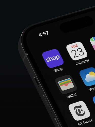
With over 20 million monthly active users, Shop is a go-to app for many when it comes to shopping and tracking packages. Whether it's a speedy checkout at your favorite store with Shop Pay, a notification that your package finally arrived, or the relationship your small business has built with loyal customers—Shop makes commerce better for merchants and buyers alike.
But despite the app’s popularity, Shop faced a perception challenge. People still thought of the brand as just “that purple button” or a package-tracker, not a delightful shopping destination. In 2021, the Shop team invited us to evolve their visual identity to reflect a shift in their brand and product: from function-first to community-driven, transactional to aspirational. Maintaining Shop’s core equities—their logo and Shop Purple—we systematized what was already working with a more expansive toolkit to build out their brand world.
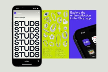
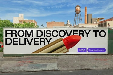
Starting with a logo refinement, we reconstructed Shop’s signature ‘o’ to make the mark more balanced, polished, and scalable. Easily legible in small product descriptions and highly expressive in bold, all-caps headlines, a new brand typeface—Good Sans—brings a more ownable voice across app and communication touchpoints.
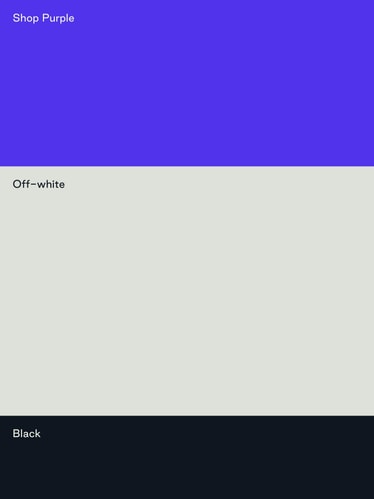
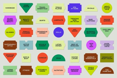
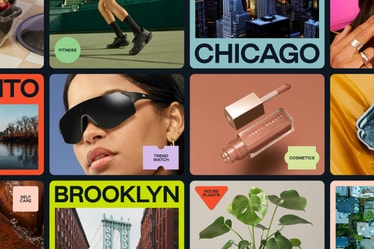
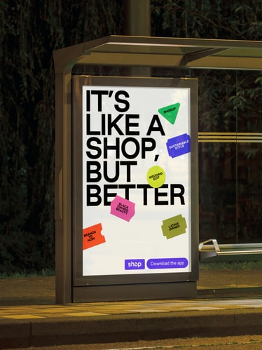
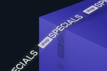
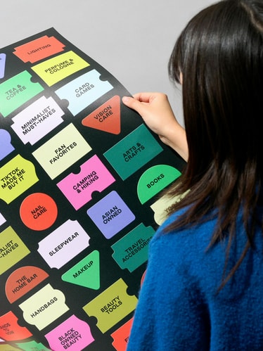
An expanded color palette allows the brand to speak to different products and merchants without an overreliance on Purple, supported by an off-white and warm black. Color shows up in the brand’s 2D sticker language, too. Inspired by old-school price tags, these diverse shapes can be superimposed on imagery to highlight secondary information without overshadowing the central message or product. Scaled up alone or clustered together, they’re equal parts function and play.
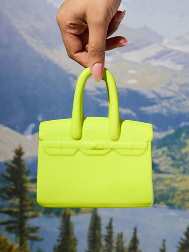
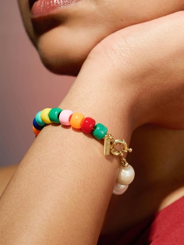
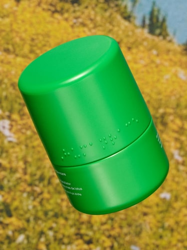
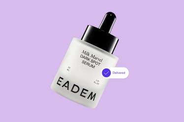
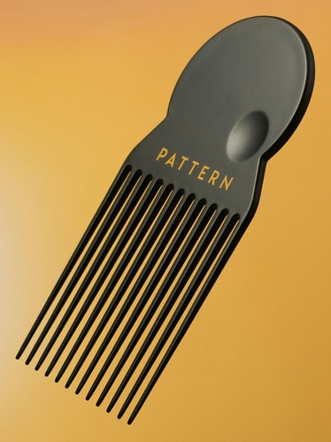
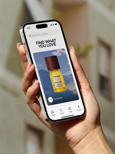
A new photography approach captures the personalities of Shop buyers and merchants through contextual lifestyle shots and portraits, bringing people to the forefront of the brand’s expression. Products themselves become the protagonists of stylized, larger-than-life scenes, while close-up shots capture unexpected views of the objects in crisp detail.
Taken together, the new toolkit marks key evolutions for Shop: from a transactional brand to an aspirational one; from a function-first app to community-driven platform; from package tracker to shopping destination with an editorial point of view.
Credits
PORTO ROCHA
Creative Direction:
Felipe Rocha , Leo Porto
Design:
Nathan Fyock , Rachel Quan , Luis Alejandro
Interactive:
Marcos Rodrigues , Niclas Resch
Motion:
Young Woo
Project Management:
Nicholas Schroder , Claren Walker
Case Study Production
Design:
Nathan Fyock , Chae Park , Bryce Carson
Interactive Design:
Marcos Rodrigues , Niclas Resch
Motion Design:
Thales Muniz
Photography:
Mari Juliano
Production:
Annie Carmichael
Model:
Roshita Thomas
Project Management:
Luciana Thiesen , Samantha Cruz
Fonts
Good Sans by Good Type Foundry
