Project Information
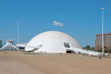
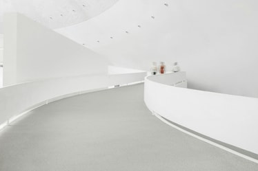
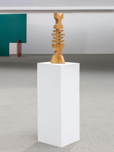
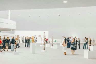
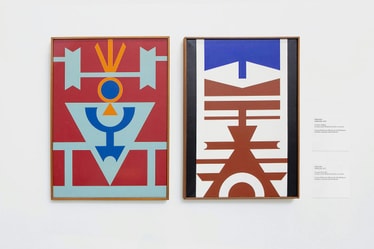
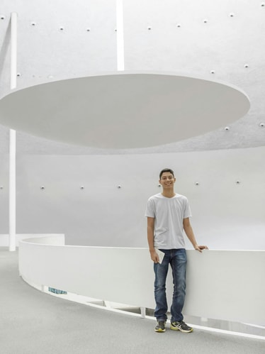
Museu Nacional da República is a public art museum in Brasília designed by renowned architect Oscar Niemeyer, a pioneer in shaping the sphere of modernist architecture in Brazil and abroad. The museum, simply referred to as “Museu” by locals, houses a plethora of cultural artifacts and hosts exhibitions that feature some of Brazil’s most prominent artists including Yutaka Toyota, Rubem Valentim and Aurelino dos Santos. Although initially incorporated into Brasília’s city planning back in the late 50s, the museum was only constructed and inaugurated more recently in 2006.
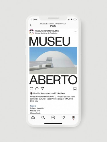
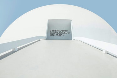
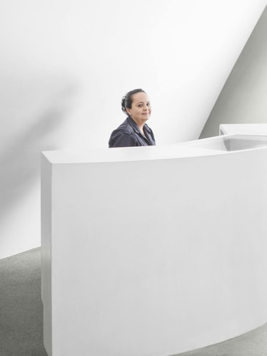
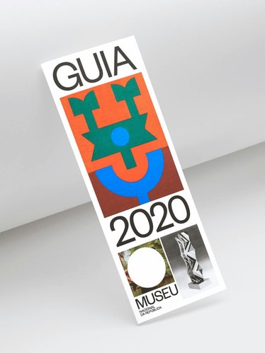
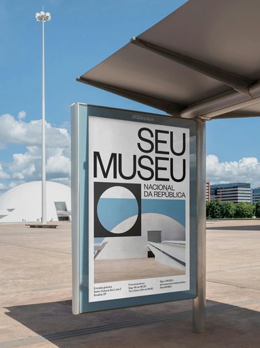
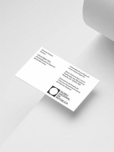
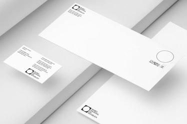
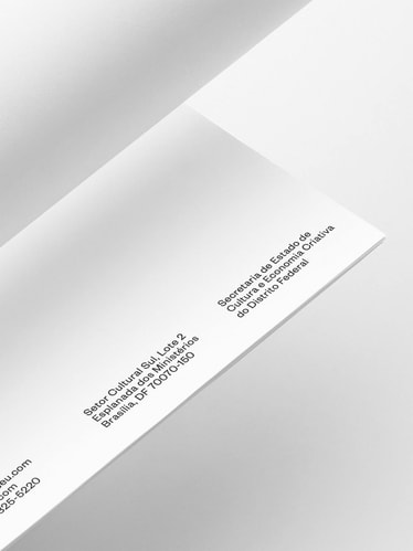
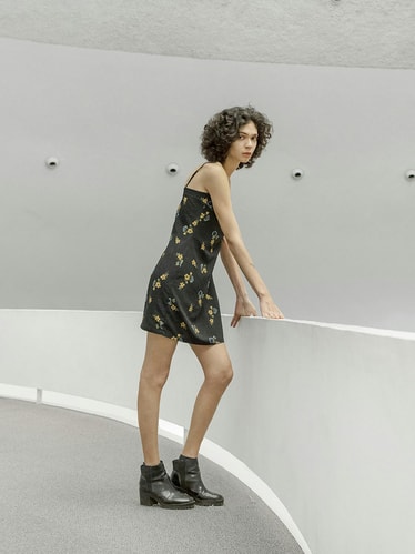
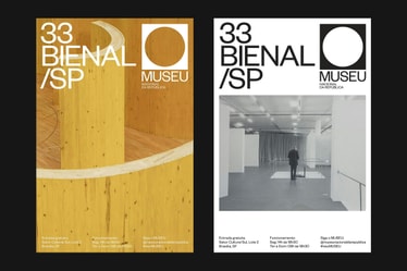
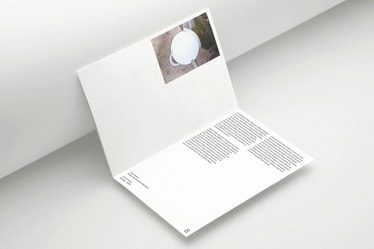
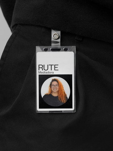
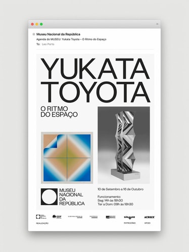
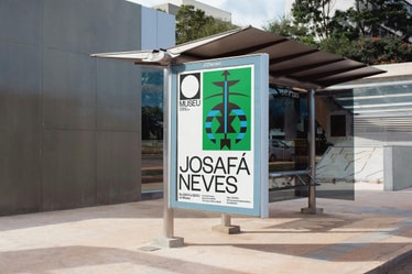
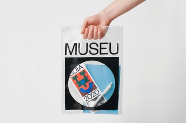
Through this project, the museum sought to increase its visibility in terms of visitation, collaborations and profitability as well as transforming the museum into a more inclusive space. Leading the rebrand, Manufatura invited us to entirely rethink Museu Nacional's graphic identity and communication strategy from a holistic perspective considering every step of the visitor's journey from digital and web applications, to the physical experience inside the dome itself. The new design system integrates a wide breadth of touchpoints including signage direction, printed materials, uniforms, stationery, merchandise and packaging, amongst others.
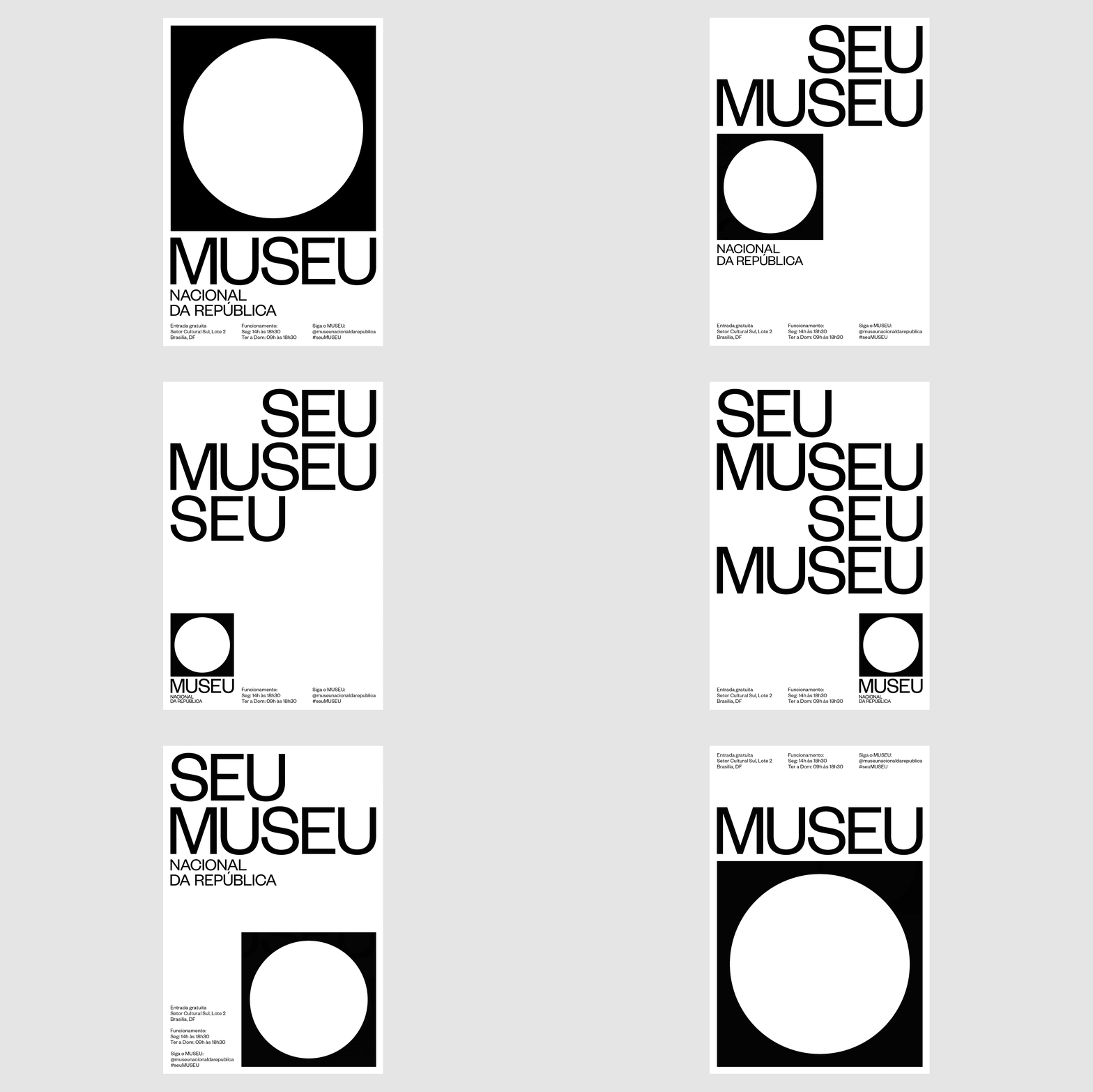
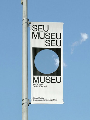
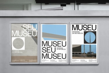
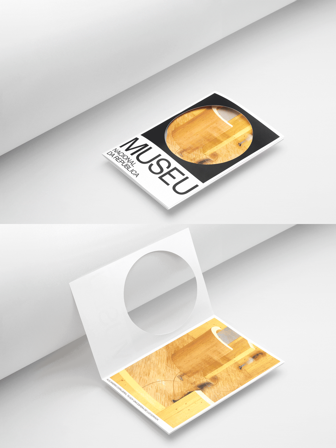
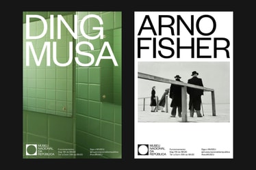
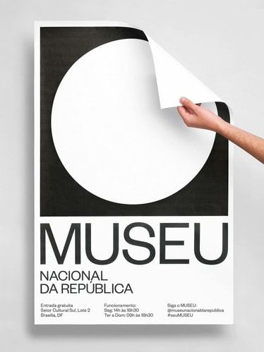
The circle and square join together to create a modern symbol for Museu Nacional. As a central feature of the identity, it represents the aerial view of Niemeyer’s dome while establishing the idea of “inside and outside”, contrasting the relationship between these two spaces. More than what it encloses, the surrounding area of the museum acts as a bustling social hub where citizens congregate, musicians perform, activists protest, others practice yoga and so on. Like a portal, the circle also functions as a graphic device that contains different imagery, be it photography, architecture, art or video, connecting and juxtaposing these two spaces in a constant state of dialogue and tension. A contemporary take on a traditionally modern typographic style, the use of Founders Grotesk recalls the visual language employed during Brasília’s early urban development while its circular letterforms allude to the museum’s infinitely curved walls.
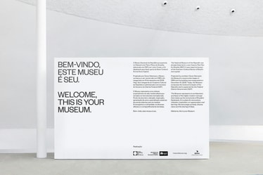
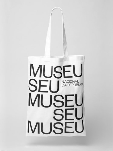
Though the museum operates upon inclusive values that seek to provide free access to contemporary art and culture, the museum (and fine art itself) can feel intimidating and elitist. With this in mind, our utilitarian visual language paired with a warm tone of voice work together to strengthen the relationship between the museum and the people. This sentiment is reinforced through the wordplay of “SEU MUSEU”, an anagram created by Manufatura meaning “YOUR MUSEUM”, which highlights each individual’s role within Museu Nacional’s dynamic ecosystem, fostered by its contributors, crew and visitors.
It is the balance between the identity’s modernist rigor and the otherwise inviting tone of voice that creates a uniquely modern-Brazilian sensibility referencing both the country’s significant contributions to modernist architecture and the warm energy of its people. Much like the symbiotic relationship between the museum's interior and exterior, each component of this identity comes together to form a similar notion of universality that surrounds the museum: a place for everyone.
Credits
Created at Manufatura
Design Direction:
Leo Porto , Felipe Rocha
Creative Direction:
Marcos Mendes Manente
Brand Strategy:
Elisa Mendes
Research:
Antônio Bonifácio, Paulo Henrique Paranhos
Copywriting:
Bruna Moreira
Design Assistant:
Vinicius Caetano
Motion Design:
Estúdio Arco , Fionn Breen
Web Design:
Danilo Campos , Carlos Kun
Social Content:
Front Filmes
Design Production:
Maricruz Meza
Guidelines:
Glauber Sampaio
Case Study Photography:
Mari Juliano , Yasmin Velloso , Leandro Neumann Ciuffo, Yuri Alvetti
