
The Challenge
Robinhood is the trading platform that reshaped modern finance by democratizing investing. But as the company matured, new offerings were introduced and the brand felt fragmented. To compete in a sea of indistinguishable fintechs, Robinhood needed to signal its evolution from startup trading app to trusted, full-service wealth platform.
The Solution
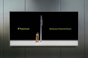
To build trust with seasoned investors, we built a brand that is sharper, sophisticated, and designed to scale. We refined core brand assets and introduced new elements including technical illustration, elevated typography, and artful imagery. The result is a brand no longer defined by disruption but by enduring trust.


Project Information
Once the domain of the elite, investing has become accessible to anyone with a smartphone. This shift is due in no small part to Robinhood: a pioneer in commission-free trading and investment on a mission to democratize finance since 2013. Fast forward to 2024, Robinhood had succeeded in becoming the trading app for the masses and had grown into a holistic suite of financial products.
But as their category matured, their offerings expanded, and competitors began to adopt similar branding strategies, it was time for a refresh. Robinhood needed an identity that would resonate with a more mature audience of seasoned investors, signaling an evolution from scrappy disruptor to a financial platform of the future. We worked closely with the Robinhood in-house team to bring their vision to life through a brand language that is sharp, sophisticated, and built to scale.
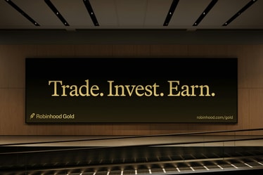
Our solution is rooted in a simple insight: when it comes to standing out in a sea of fintech sameness, less is more. This approach not only guided our refinement of individual brand elements, but inspired how we brought them together in a smart, modular system that could flex across their multiple finance products — from traditional stocks and crypto to their new premium subscription service, Robinhood Gold.
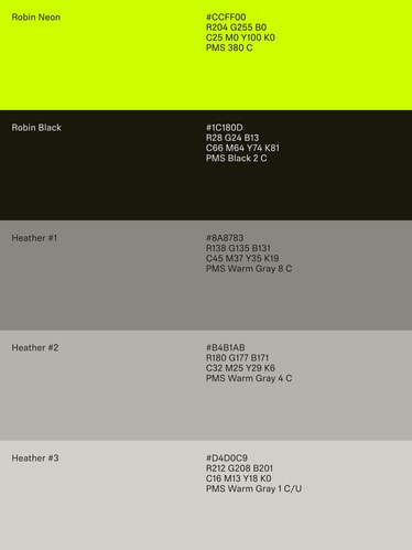
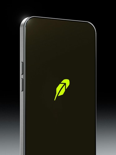
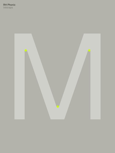
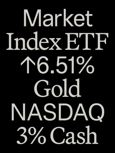
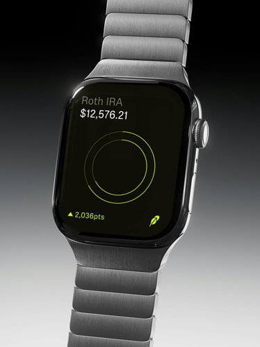
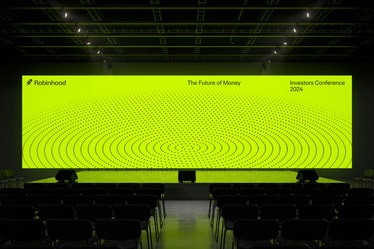
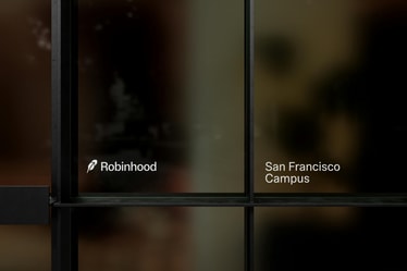
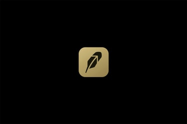
We began by streamlining their iconic feather symbol to draw attention to the upward arrow within it, then polished the letterforms of the wordmark — resulting in a more intentional brand signature. The typographic system features a new sans serif, Robinhood Phonic. Where their previous sans lacked character, Phonic’s delicate ink-traps bring personality without sacrificing precision. This is balanced by headlines set in a warm yet intelligent serif, Martina Plantijn. Our color strategy departs from competitors’ rainbow approach, opting instead for a focused palette of black, white and mature neutrals that make room for pops of Robin Neon: a new electric yellow green unique to Robinhood.
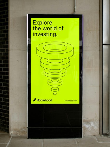
While the previous identity’s emphasis on futuristic illustrations worked for a singular product, it lacked the flexibility to speak to their expanded range of financial tools. We decided to pivot to a highly technical illustration style inspired by financial graphs familiar to investors. In contrast to the previous identity’s complex and richly detailed artwork, the new graphic language is easy to replicate and scale, allowing Robinhood to set an expert tone in touchpoints large and small across their diverse product suite.
Taking cues from lifestyle and luxury fashion, we introduced a photographic language that depicts singular subjects through a graphic and sophisticated lens — an unexpected move in the finance space. If in the past Robinhood existed in a zoomed-out, illustrated world of entire futuristic cities, the rebrand pushes them forward in the opposite direction: zooming in on real, individual subjects open to interpretation. In this new image world, a closeup of a double-yolked egg could speak to returns, or linked chains could allude to cryptocurrency. Renowned still-life photographer Lauren Bamford brought this strategy to life through a suite of evergreen brand imagery.
The evolved identity marks an important moment in Robinhood’s trajectory, reflecting their growth as a company and the maturity of the fintech category. Seamlessly flexing between product interfaces and marketing communications, the new visual identity will be fully integrated across all surfaces by early 2025.
PORTO ROCHA
Creative Direction:
Felipe Rocha , Leo Porto
Design:
Joseph Lebus , Natalia Oledzka , Marek Nedelka , Eyal Chowers , Yedo Han , Surya Anand
Interactive Design:
Marcos Rodrigues , Maya Flood
Motion Design:
Josh Krauth-Harding
3D Design:
Pedro Veneziano
Illustration:
Philip Intile
Composer:
Amedeo Inglese
Project Management:
Hamilton Yu
Account Director:
Luciana Thiesen
Operations Director:
Nicholas Schröder
Robinhood
Carlo Michelangelo Luetto, Tim Scales, Daniel Haire, Angeline Toh, Devon Lach
Photography
Lauren Bramford , Sarah Pritchard
Case Study Production
Design:
Joseph Lebus , Yedo Han , Surya Anand
Interactive Design:
Marcos Rodrigues , Maya Flood
Motion Design:
Josh Krauth-Harding
3D Design:
Pedro Veneziano
Copy:
Claren Walker
Project Management:
Hamilton Yu
Production:
Annie Carmichael
Fonts
RH Phonic - Schick Toikka
Martina Plantijn - Klim Type