


Project Information
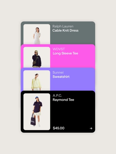
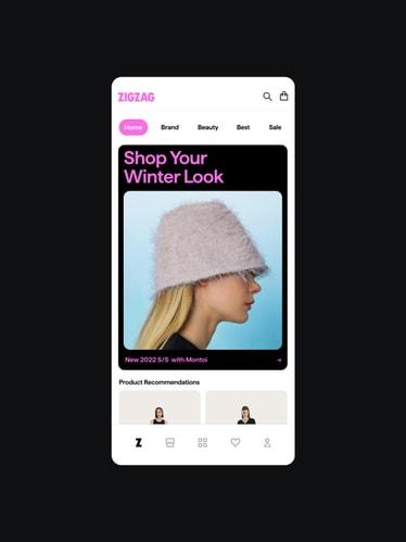
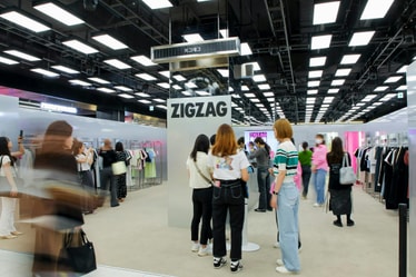
Zigzag is the largest shopping app in Korea, with over 35 million downloads and counting. Focused on fashion, beauty, and lifestyle, the app includes over 7,000 stores: from emerging Korean designers such as Insilence and Le to household names like Nike. Already popular among Gen Z in Korea, the brand needed a more precise, contemporary identity that would allow them to expand into new markets and keep pace with fashion. The rebrand updates core equities while reflecting the limitless exploration that has made Zigzag a go-to shopping destination since 2015.
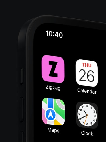
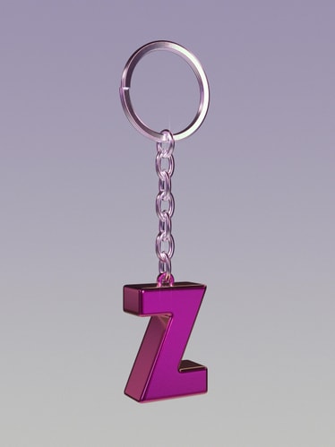
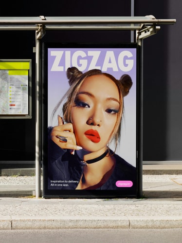
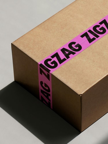
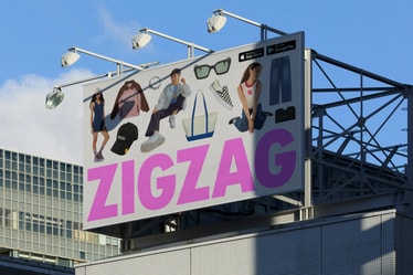
Zigzag’s evolution started with the wordmark. Drawing inspiration from the typography of fashion periodicals, we transformed an expectedly digital wordmark into one that can span from a support mechanism to a bold icon in its own right. The condensed ‘Z’ also flexes as a confident and dynamic shorthand for the brand. And just as youth styles and identities are constantly in flux, so is Zigzag’s mark — often taking on different materialities in high-fidelity 3D.
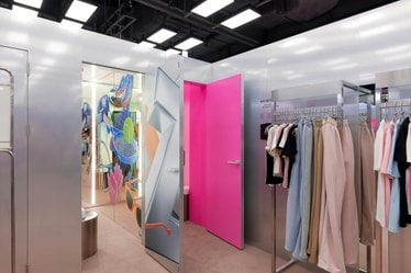
A vibrant new palette brings an energy previously missing from the identity. First, we updated Zigzag’s signature pink to be fresher, brighter, and (literally) cooler. Complementing Zigzag pink, we also built out an expansive palette that takes cues from a more youthful fashion world.
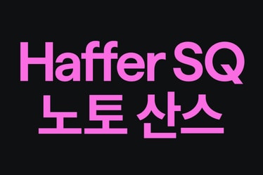
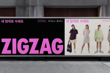
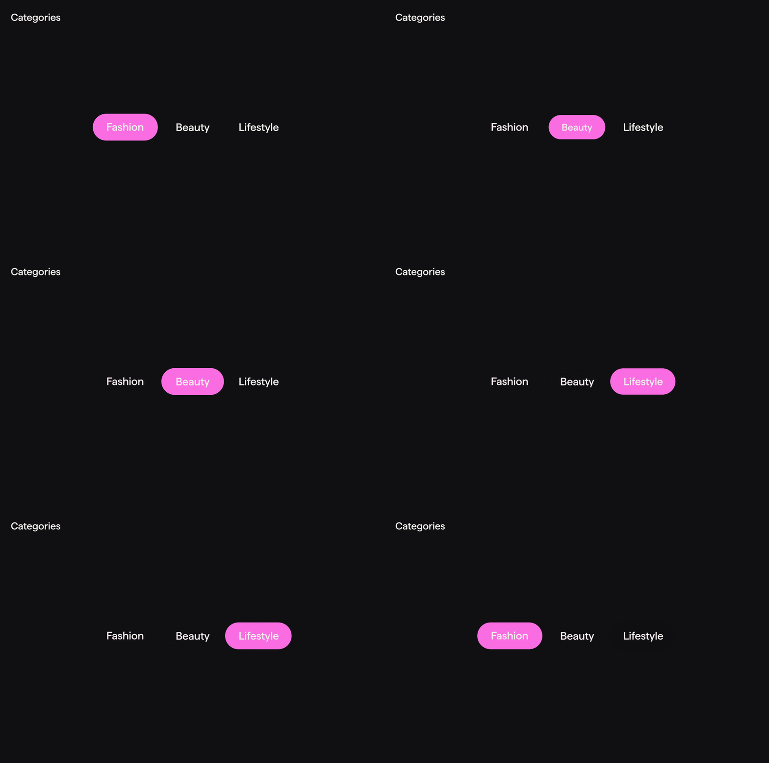
Clean sans serif typography acts as a counterbalance to the system’s more expressive elements. Both Korean and Latin typefaces selected share similar characteristics and weights, allowing the brand to communicate seamlessly across multiple languages.
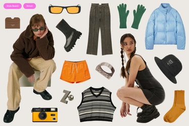
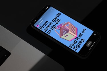
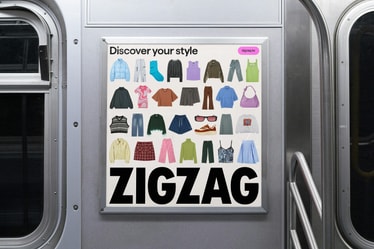
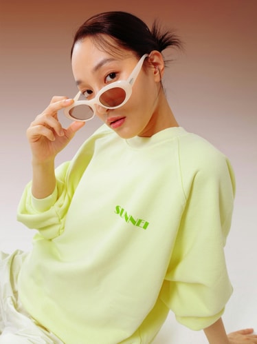
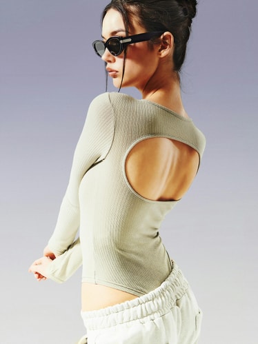
A new photography system brings together exuberant, editorial brand shots with more casual UGC that can be cut-out and recontextualized in the vernacular of fashion moodboards. We also designed a library of custom 3D ‘stickers’ with social in mind — a playful visual language that Zigzag’s community can experiment with in the context of their own IG stories.
As the brand expands into more global markets, the new identity announces Zigzag as a relevant and exciting shopping destination to explore. Trends move fast. Now Zigzag can move with them.
Credits
Creative Direction:
Leo Porto
Design:
Joseph Lebus , Chae Park , Leo Porto
Motion Design:
Thales Muniz
Interactive Design:
Marcos Rodrigues , Heena Chung
3D Design:
Kiwoong Byeon, Carolina Carballo , Chae Park
Project Management:
Luciana Thiesen , Samantha Cruz
Korean Translator:
Peace Park
Zigzag
June Shim, Jungyoung Sun
Fonts
Haffer by Displaay
Kanyon by Hurufatfont
Noto Sans KR by Google Fonts
