
The Challenge
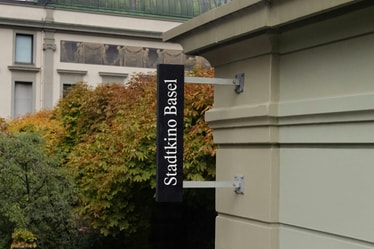
As Switzerland's oldest contemporary art institution, Kunsthalle Basel has always operated on the edge of culture, taking risks on new artists, mediums, and ideas for 150 years. But its neutral visual identity lacked the clarity and distinction to stand up to its cultural impact.
The Solution
Kunsthalle Basel’s solution lay in a paradox: an institutional brand with an anti-institutional spirit. Anchored with a timeless yet flexible monogram and serif type, the identity is free to break convention elsewhere — allowing them to respond to culture in real time.
Project Information
Few institutions can claim a 150-year history on art’s bleeding edge. Kunsthalle Basel is one of them.
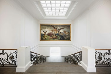
As the oldest contemporary art space in Switzerland, they built their reputation by going against the grain: showing artists before they were known, embracing new media before it was the norm, and opening their doors to the public while peers catered to the elite. Without a permanent collection, Kunsthalle has always prioritized what’s now and next, giving early platforms to artists who would go on to shape history: from Marcel Duchamp to Anne Imhof.
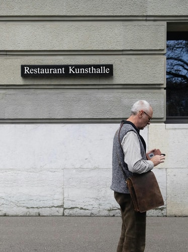
In 2024, curator and director Mohamed Almusibli took the helm with a clear vision: to turn the institution into a true host. Not just for the art world, but for anyone curious enough to step inside. His approach was warm, expansive, and globally minded — a conscious shift from the neutrality that defines much of Swiss cultural design. The vision was changing, but the old identity was too neutral and ‘undesigned’ to support it.
Our opportunity was clear: to build an institutional brand with an anti-institutional spirit. On one hand, the system had to provide the structure and recognition that the previous identity lacked, creating a clear stamp for KB. On the other, we had to reflect their avant-garde ethos by giving the identity enough freedom to adapt to an art world in constant flux.
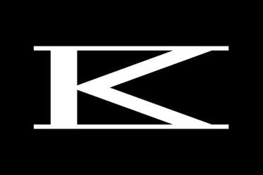
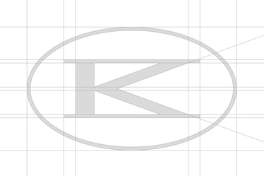
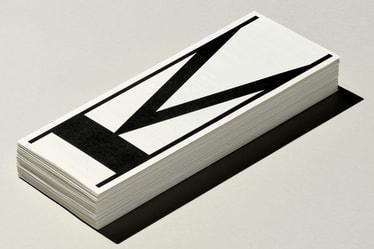
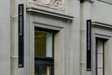
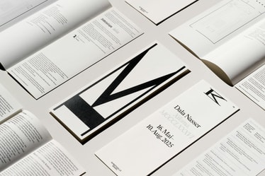
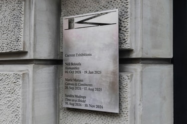
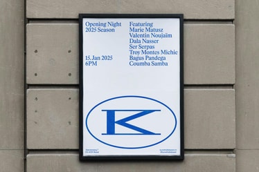
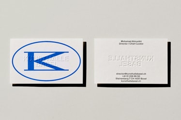
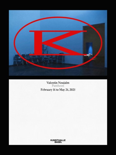
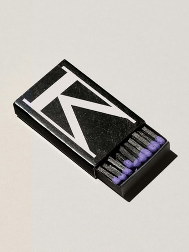
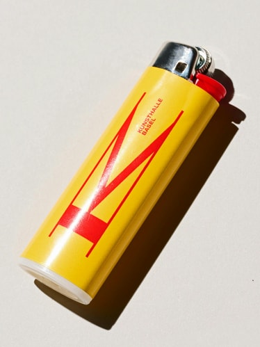
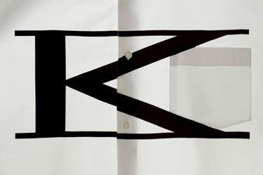
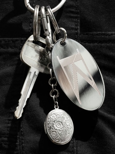
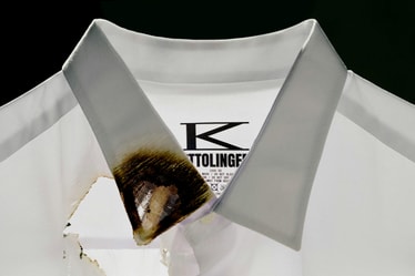
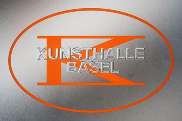
At the center of the identity is a new monogram that merges K and B into a single, iconic graphic gesture that can be read as either letter. Inspired by Kunsthalle Basel’s neoclassical exterior and ever-evolving interior, the mark captures a tension between permanence and change. It’s a confident stamp when applied in a traditional sense, but not too precious: the mark can be stretched, compressed, and rotated in response to its context. This sense of play allows it to be in dialogue with the work, while remaining unmistakably KB. Unlike the formulaic wordmarks common across the cultural sector, the system leads with the monogram: a distinctive, iconic signature for the institution.
Our motion language draws directly from the geometry and flexibility of the KB monogram. Its stretch, compress, and circular path behaviors become key in transitions: moving between information, imagery, and the monogram in an unexpected way across digital applications.
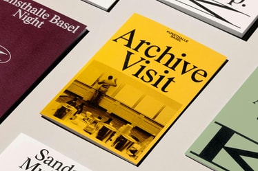
The website design translates the identity into an inviting digital experience. We restructured the entire user experience and information architecture to make navigation more intuitive, allowing visitors to easily explore both upcoming programs and an extensive archive. We also introduced a scalable UI design system to account for different types of content. Visually, full-bleed imagery and an editorial flow invite users to discover, sprinkled with moments of surprise that bring the identity’s experimental edge online: from elastic transition moments in carousels to interface easter eggs like a moveable menu.
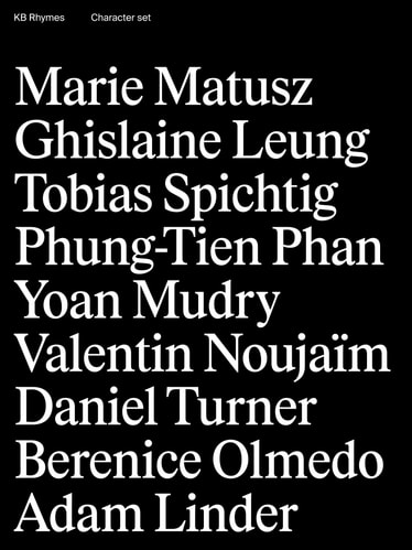
Typography is key in giving Kunsthalle Basel the voice of an intelligent yet approachable host. We collaborated with Swiss foundry Maxitype to customize a headline typeface called KB Rhymes, a humanist serif with roots in Times New Roman. It supports artwork without overshadowing it, while its slightly condensed proportions give it enough presence to stand confidently on its own. Paired with Suisse International — a simple, highly legible sans used for body copy and exhibition text — the system balances functionality with character.
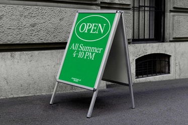
In color, we gave the brand two modes: neutral when paired with artwork, and vibrant in type-led layouts. Where the previous identity avoided color altogether, we introduced a secondary palette with an analog feel, adding energy and expression while keeping focus on the art when appropriate.
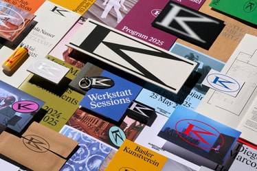
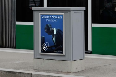
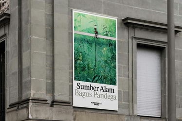
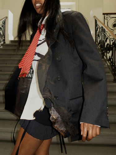
Built with collaboration in mind, the system is flexible enough to be remixed by the artists it serves. Touchpoints like exhibition posters become a shared canvas, where the identity can bend, break, and adapt. This openness not only invites dialogue between brand and artists, it ensures the identity remains relevant over time.
Credits
PORTO ROCHA
Creative Direction:
Felipe Rocha , Leo Porto
Graphic Design:
Gabriela Carnabuci , Etienne Murphy , Latoya Breu
Interactive Design:
Marcos Rodrigues , David Fiz , Giovana Yahiro
Motion Design:
Thales Muniz , Josh Krauth-Harding , Charles Carlos
3D Design:
Pedro Veneziano
Strategy:
Natalee Ranii-Dropcho , Claren Walker
Project Director:
Luciana Thiesen
Project Management:
Hamilton Yu , Natalie Kilic
Partners
Web Development:
noncitizen
Type Foundry:
Maxitype
Kunsthalle Basel
Mohamed Almusibli, Sina Bauer, Vera Oberholzer, noncitizen.
Special thanks to: Mara Berger, Rinny Biberstein, Layla Jenny
Case Study Production
Graphic Design:
Gabriela Carnabuci , Etienne Murphy
3D Design:
Pedro Veneziano
Interactive Design:
Marcos Rodrigues , David Fiz
Motion Design:
Thales Muniz
Copy:
Claren Walker
Project Management:
Natalie Kilic
Case Study Photography:
Mari Juliano , Ronja Burkard
Case Study Drone & 3D Footage:
Studio Màti
Photoshoot Production:
Annie Carmichael
Fonts
KB Rhymes – Maxitype
Suisse Int’l – Swiss Typefaces