







Project Information
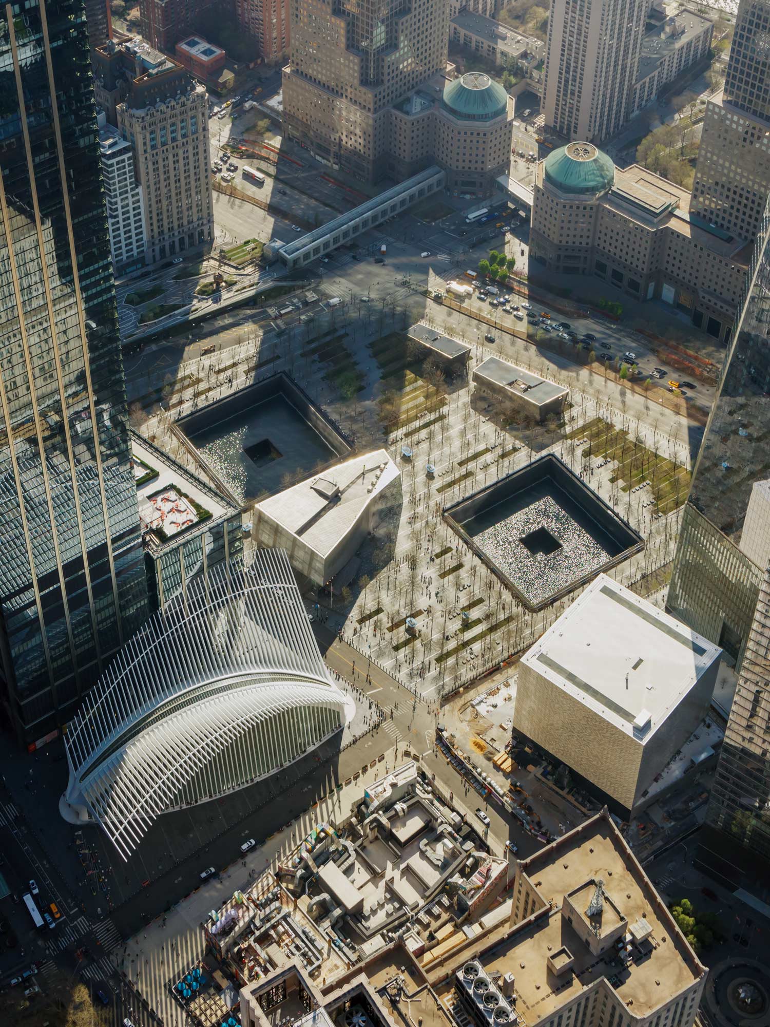
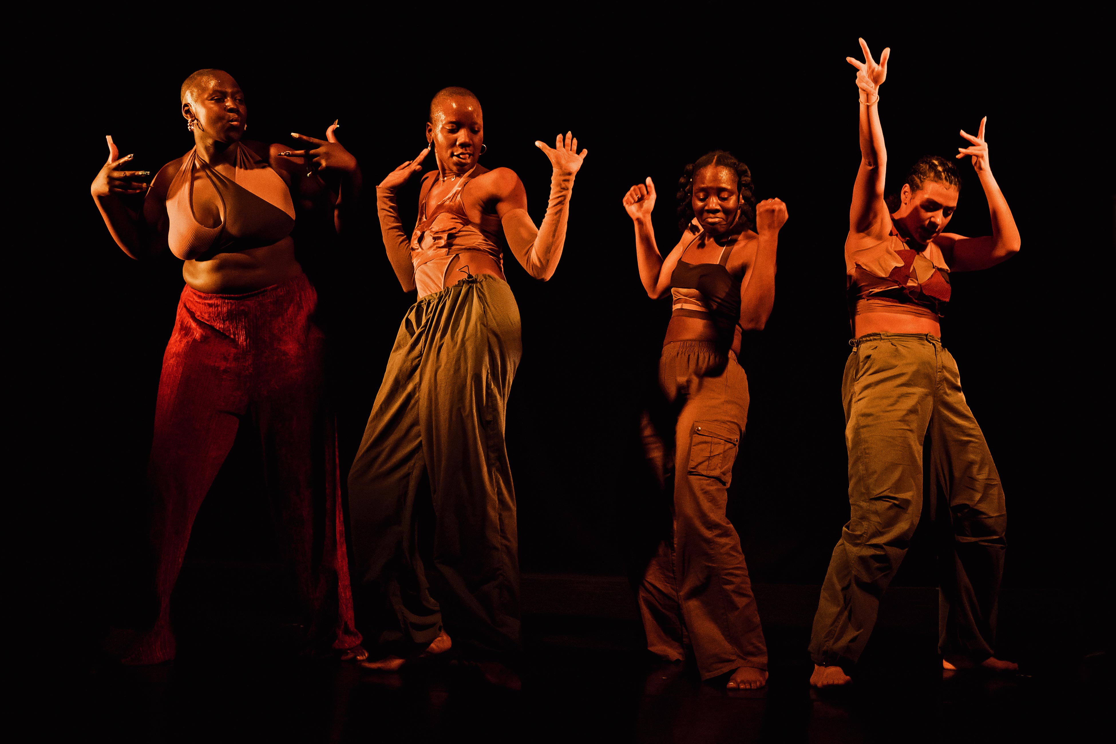
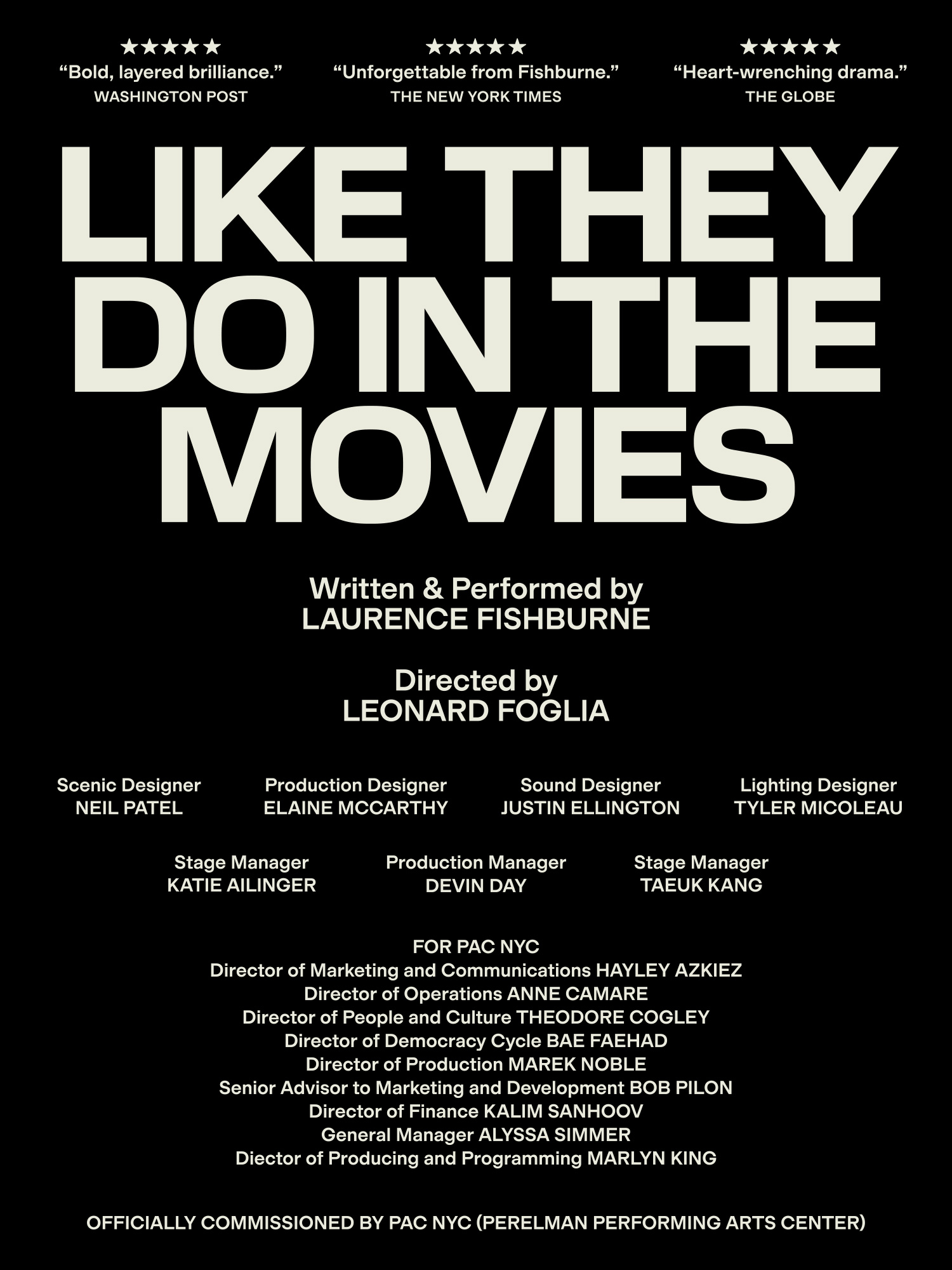
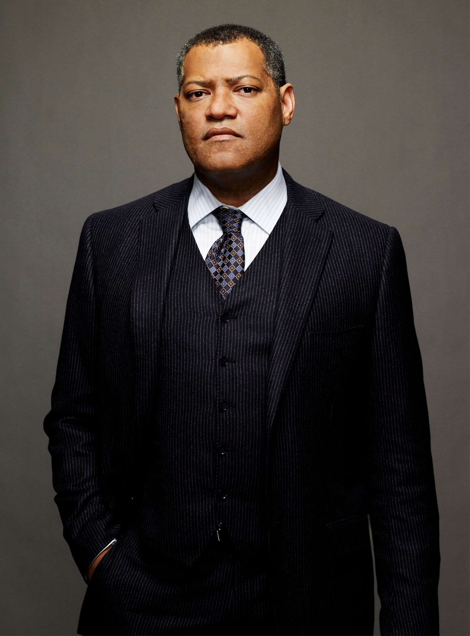
Opened in September 2023 and located at the historic World Trade Center site in Lower Manhattan, Perelman Performing Arts Center (PAC NYC) is the cultural capstone and final piece of the rebuilding of the World Trade Center after 9/11. Envisioned over 20 years ago during the re-imagination of Lower Manhattan under then Mayor Mike Bloomberg, PAC NYC offers a new kind of public space where people from all walks of life are invited to gather, eat, drink, and experience the transformative power of performing arts. Its modular theater spaces can be configured to accommodate a truly interdisciplinary program: from a ballroom-infused production of CATS to hard-hitting contemporary opera to Laurence Fishburne’s one-man tour de force.
In the lead-up to opening season, we embarked on a journey — from brand strategy to naming, design to voice — to invite the world in to a new kind of performing arts center. To establish PAC NYC as this cultural beacon, a brand position of “The World’s Stage” welcomes the five boroughs and beyond. For the PAC NYC team, the audience in the seats were as crucial as the performers on the stage — but given the historical elitism of the category combined with a symbolic site many hadn’t visited since 9/11, the brand had barriers to overcome in order to extend a warm welcome. To succeed, we needed to capture a contemporary mindset and radiate mass appeal.
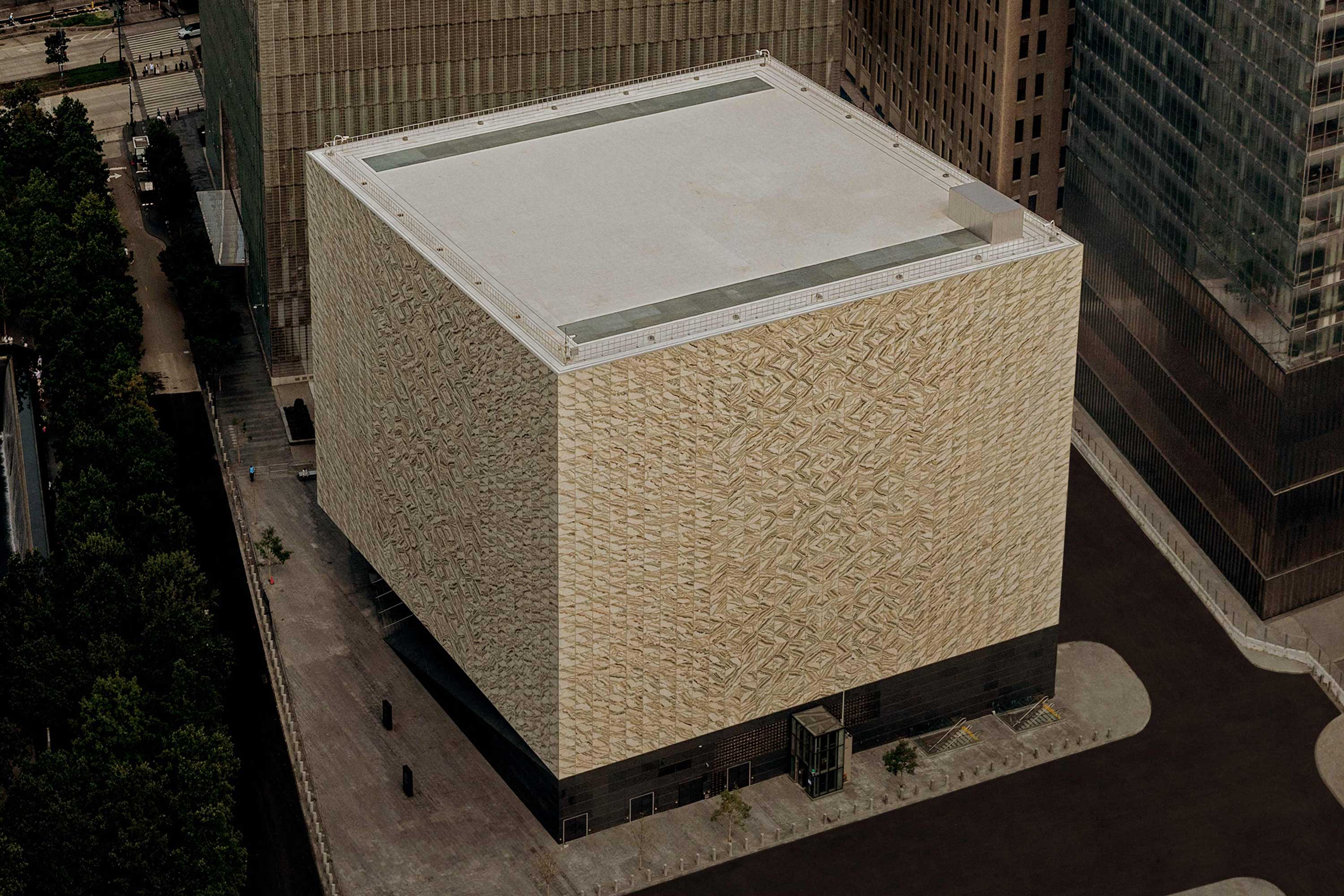
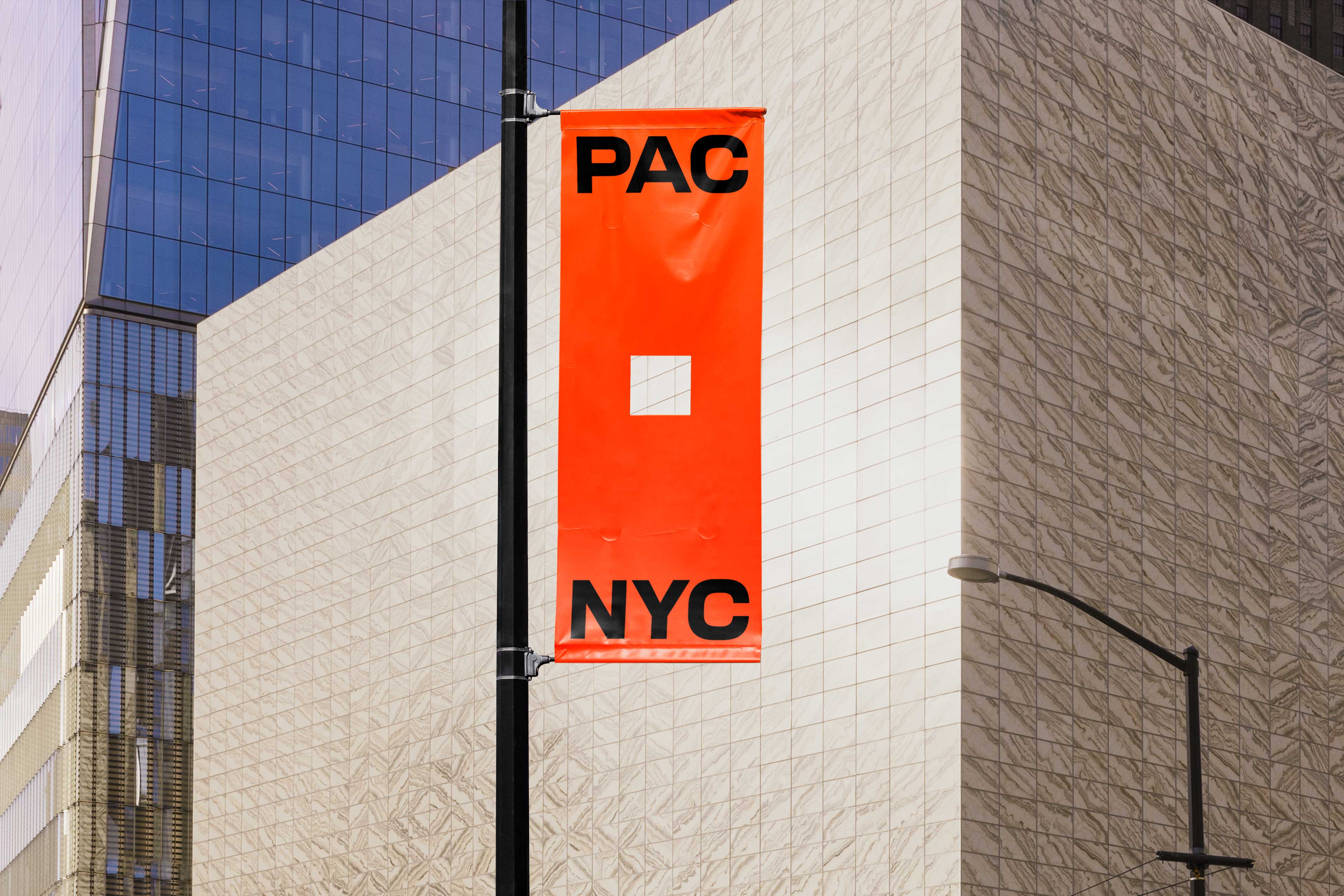
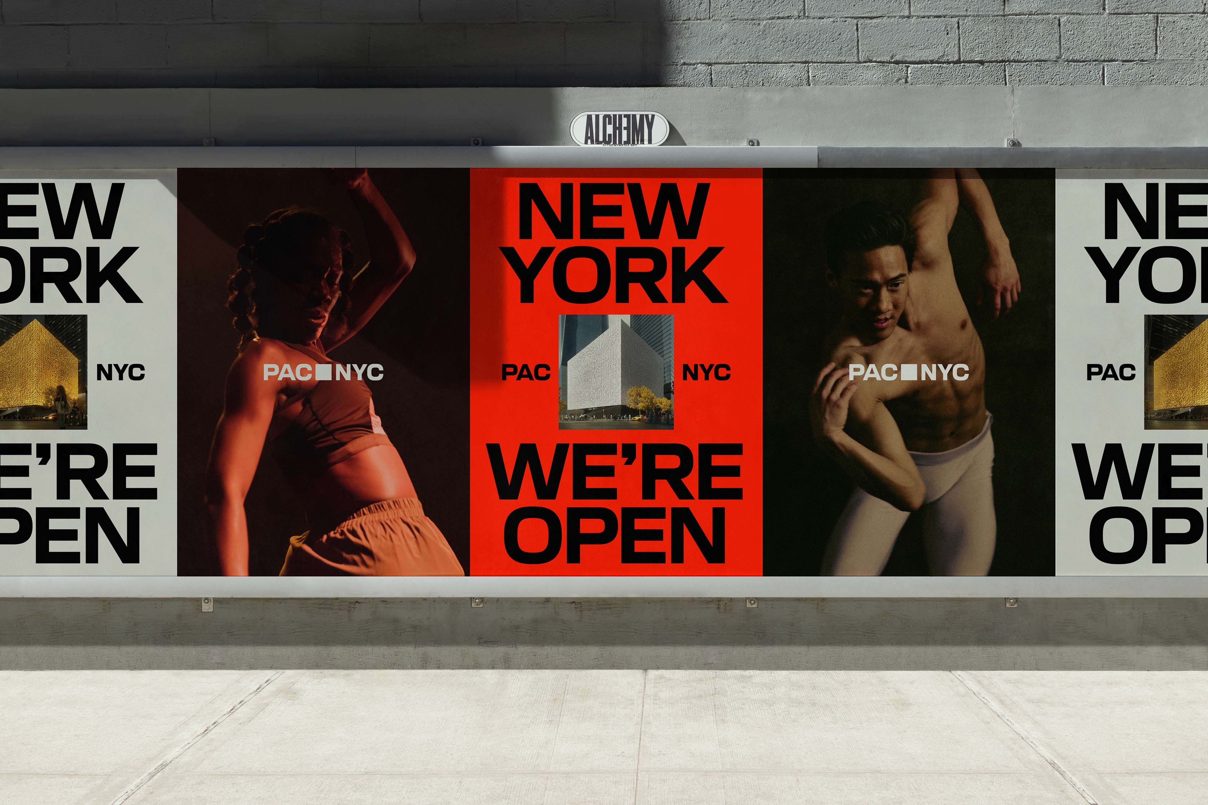
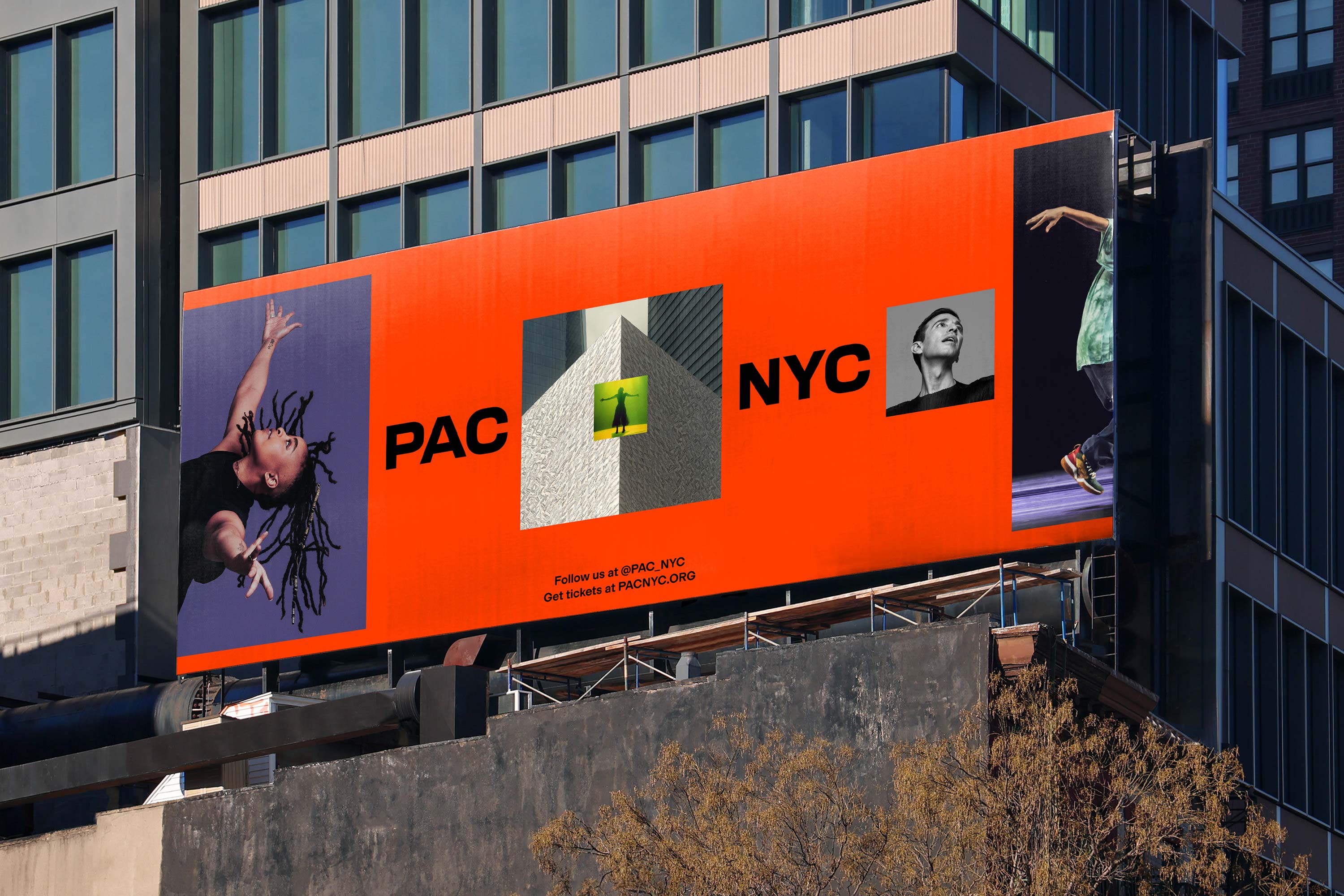
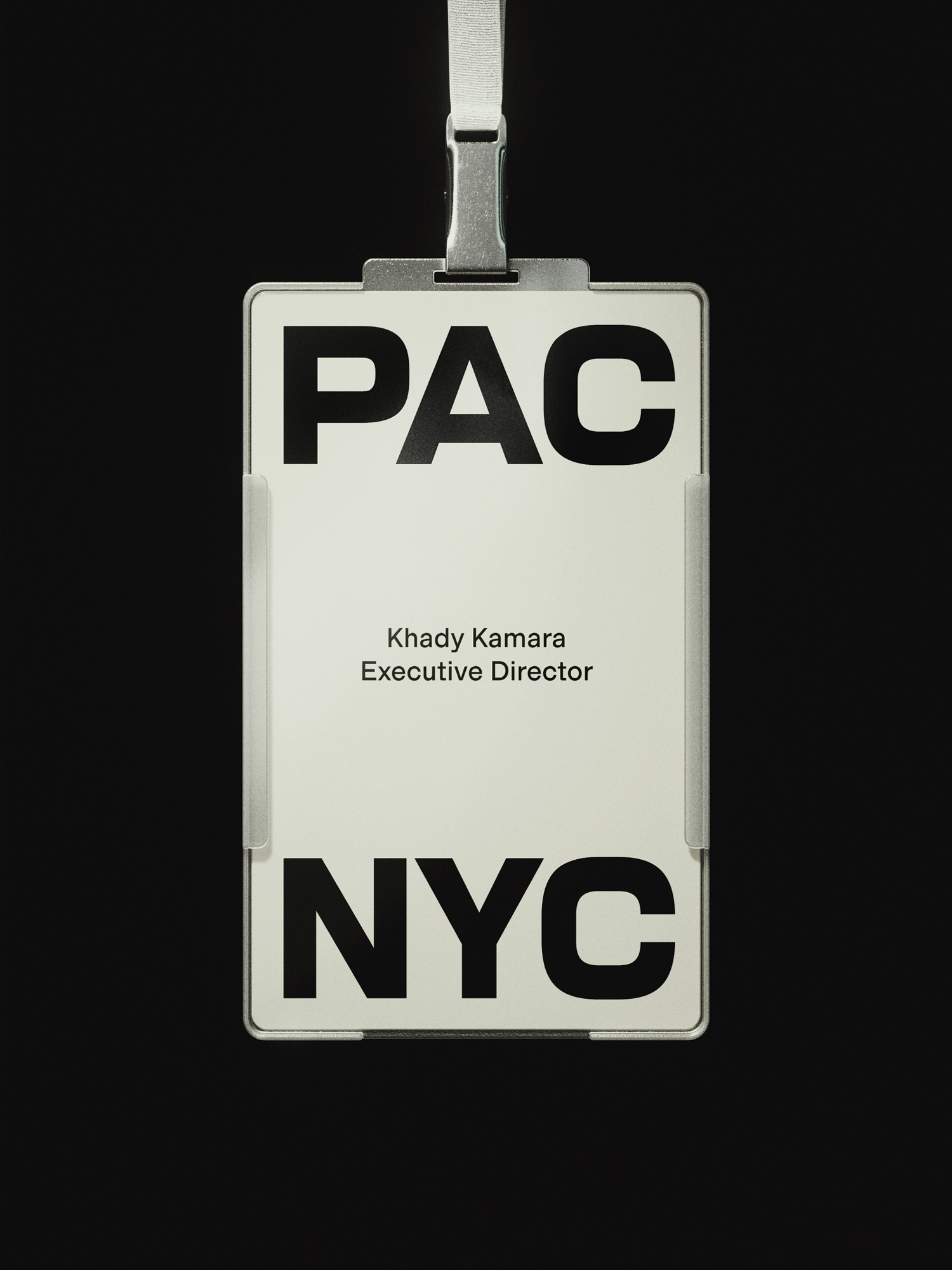
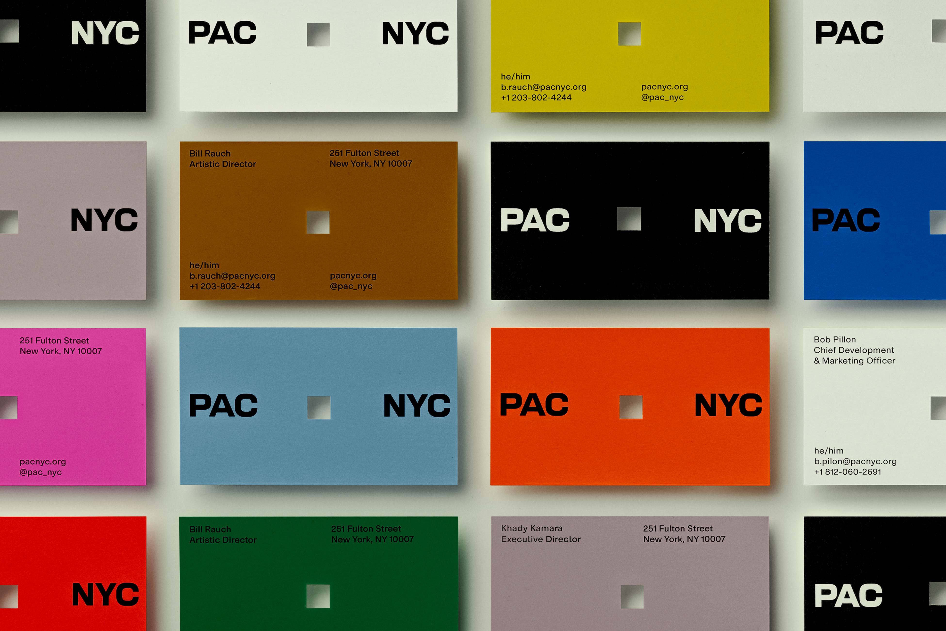
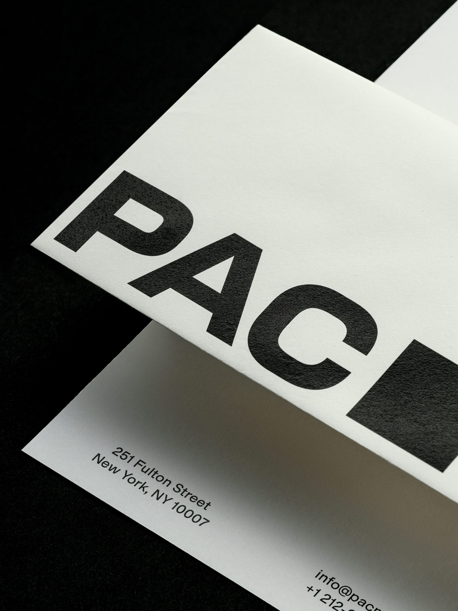
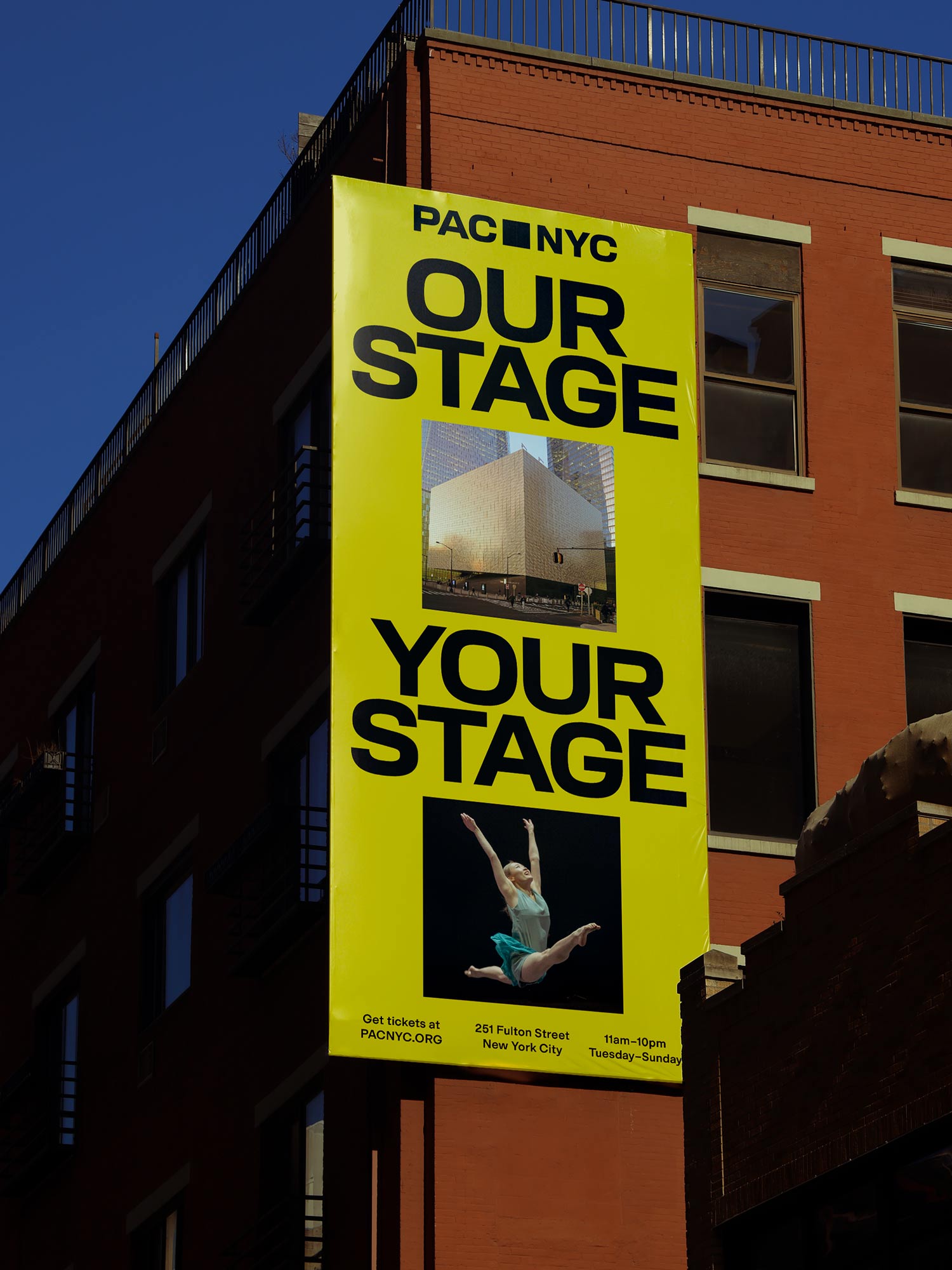
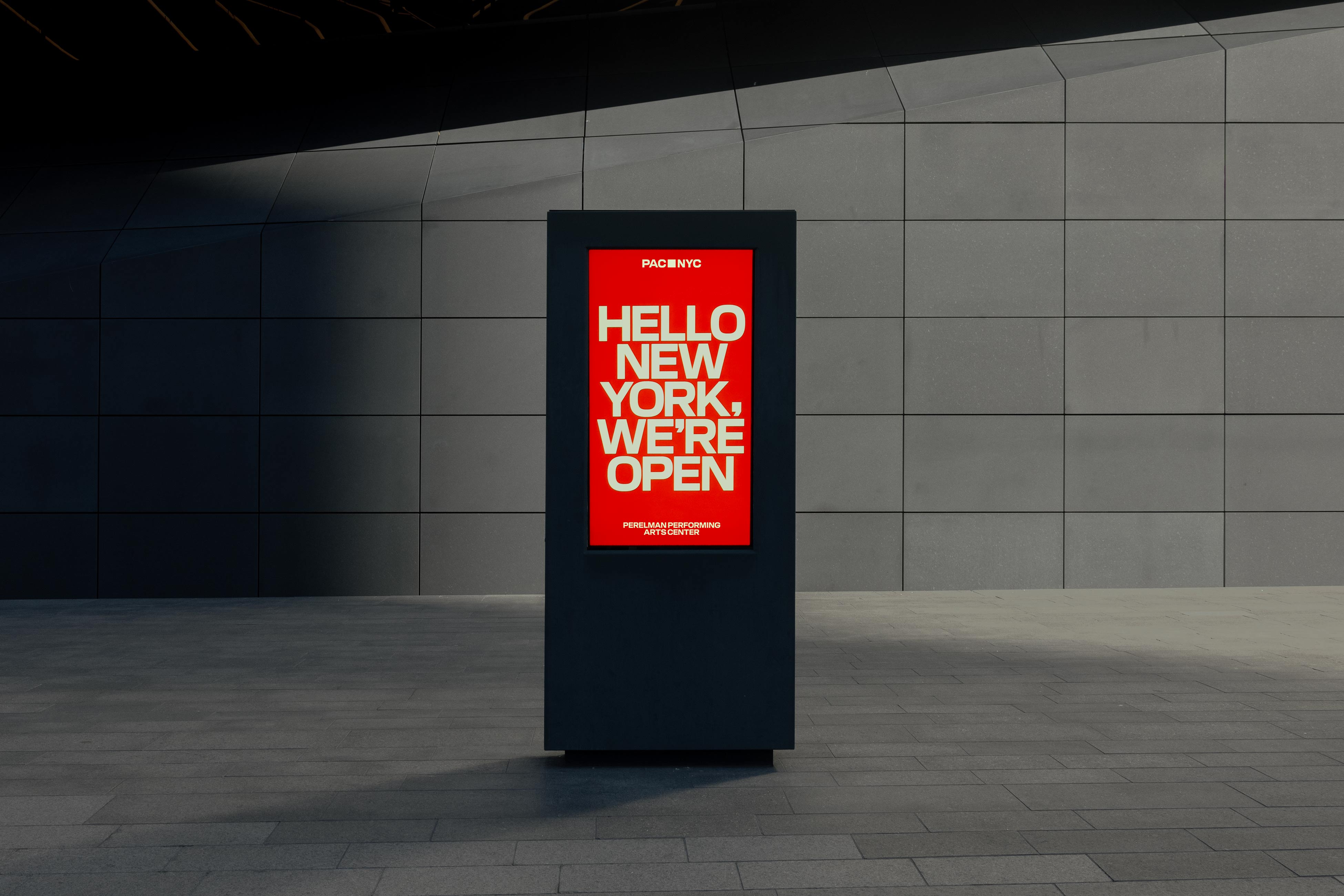
Translating this into an identity system, we took PAC NYC’s iconic architecture as our starting point: a cube at eye level, a square at aerial view. To mirror this in the logo, each letter was meticulously designed to a square ratio, which becomes the simple symbol that sits at its core with "PAC" and "NYC" set on either side. The logo stands as an icon in its own right and expands into a powerful framing device for a diverse array of content: a way for people to see themselves in the brand and a glimpse into the diverse programming happening within its walls.
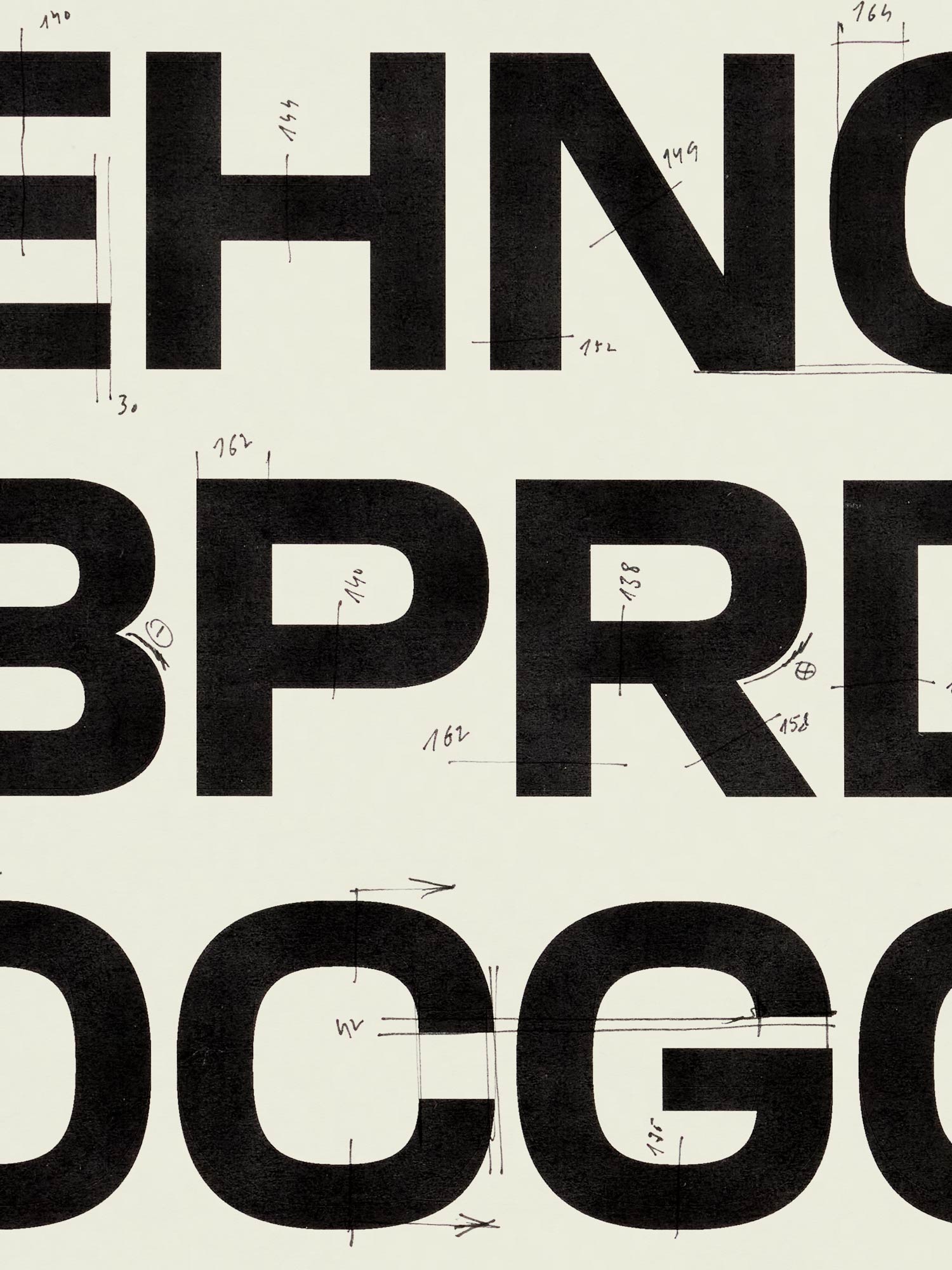
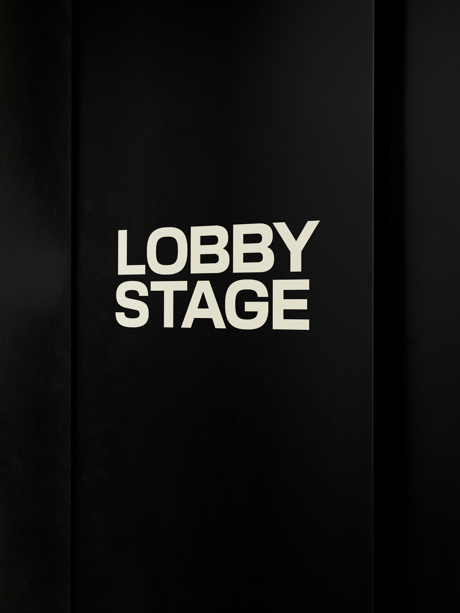
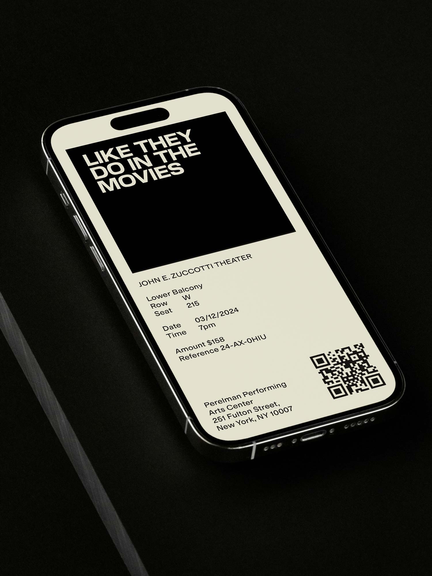
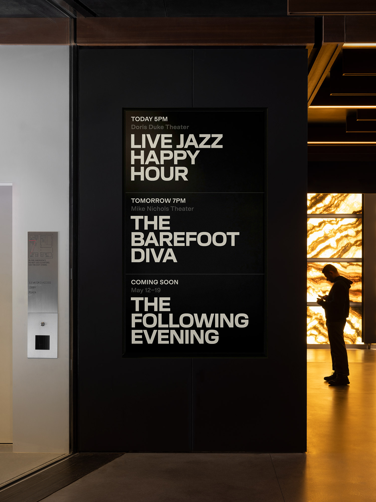
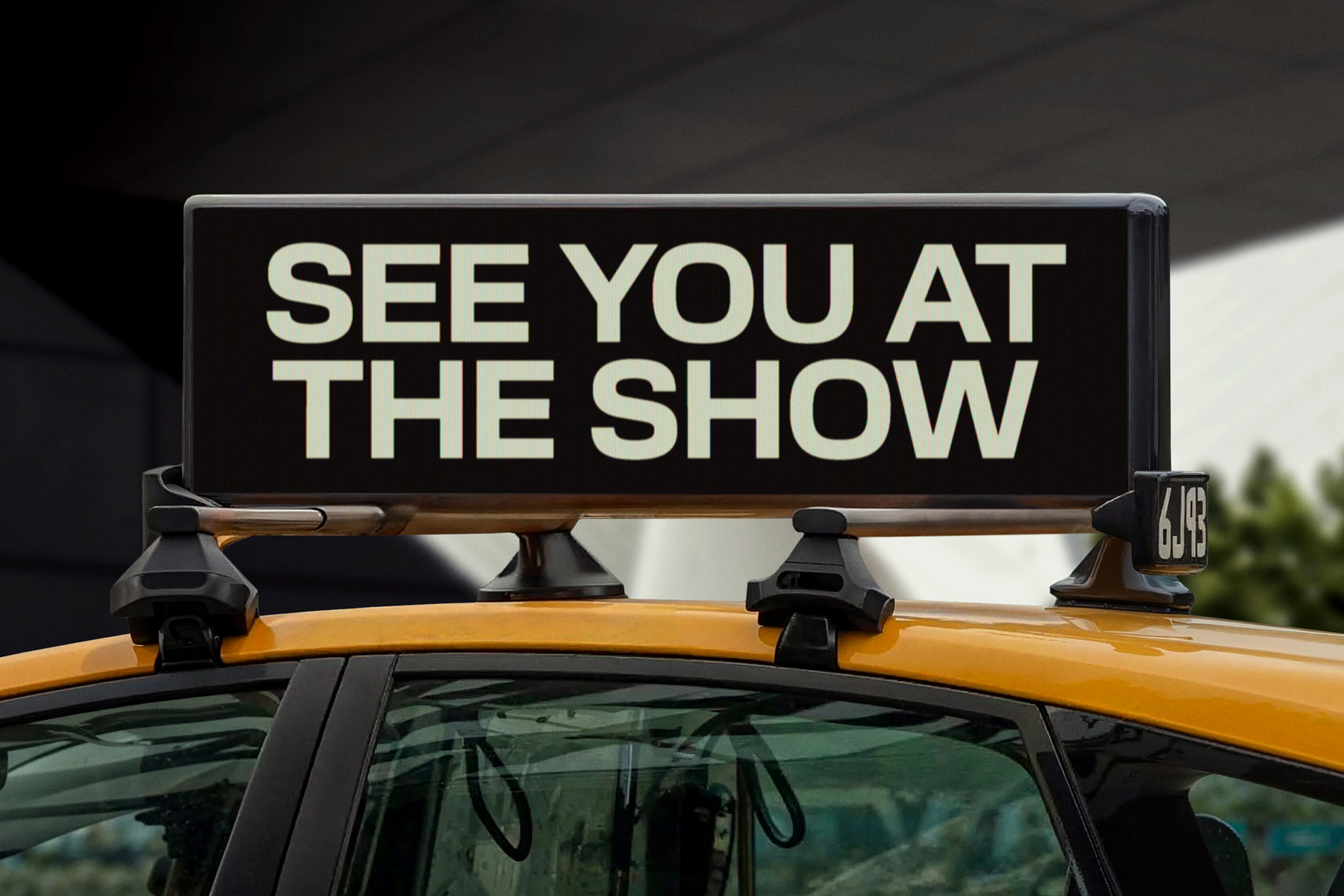
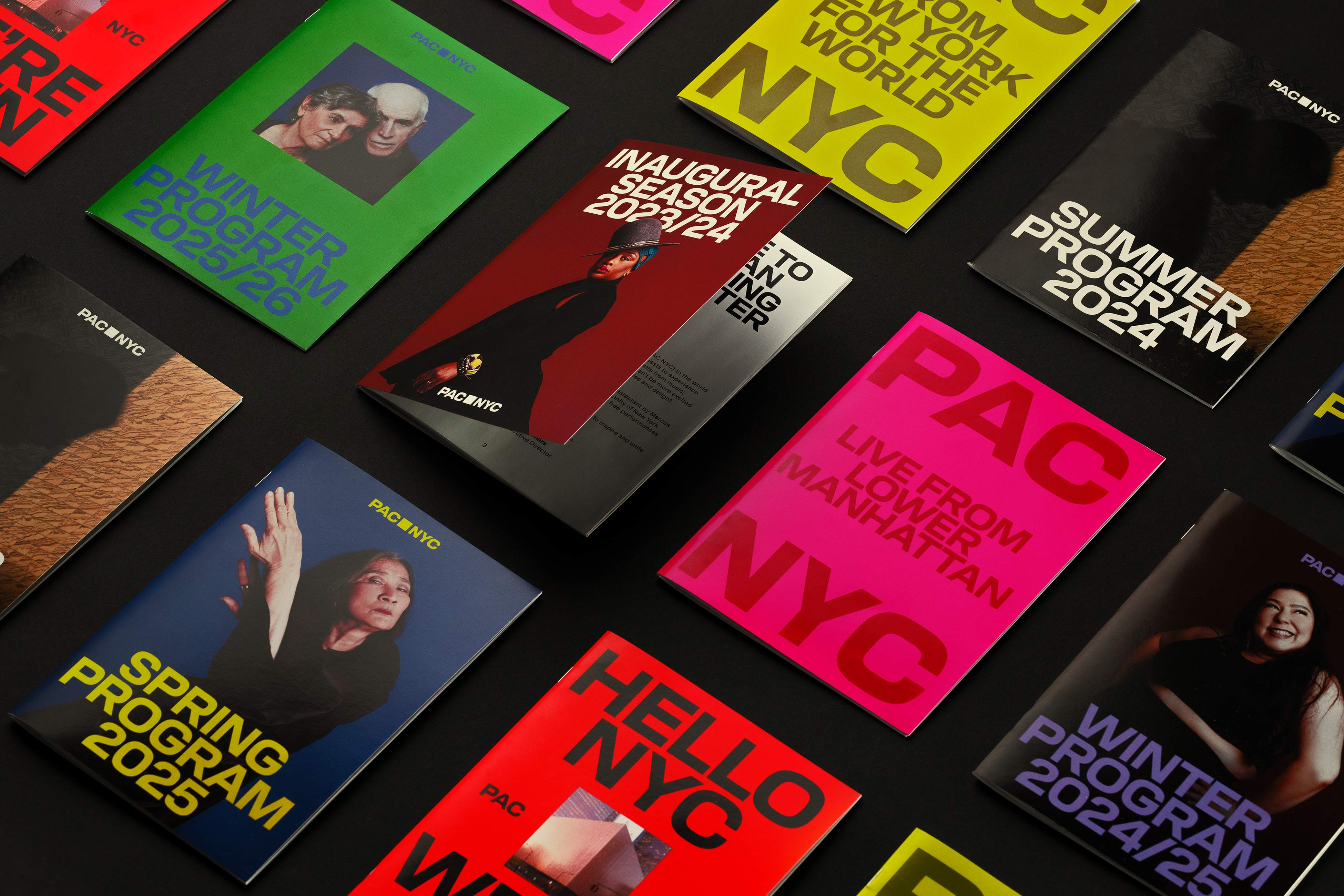
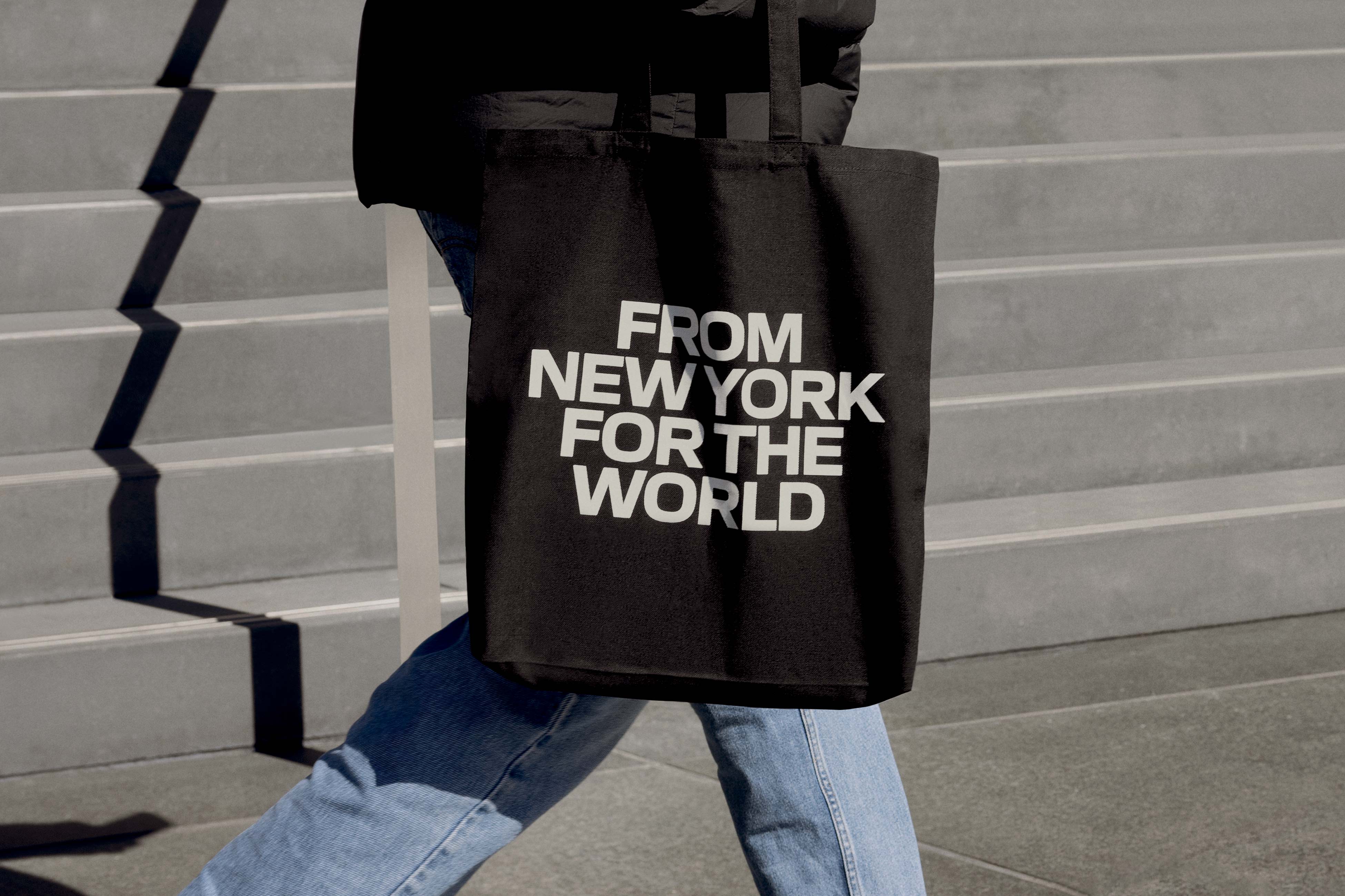
To support their many communication needs and ambition for mass appeal, we designed a custom display typeface, PAC Display, that references the form of the building with a distinctly New York vernacular referencing 19th Century Gothic street signage. A flexible approach to typesetting and layouts ensures PAC Display can become synonymous with the institution over time, while adapting to a wide range of interdisciplinary programming without feeling repetitive.
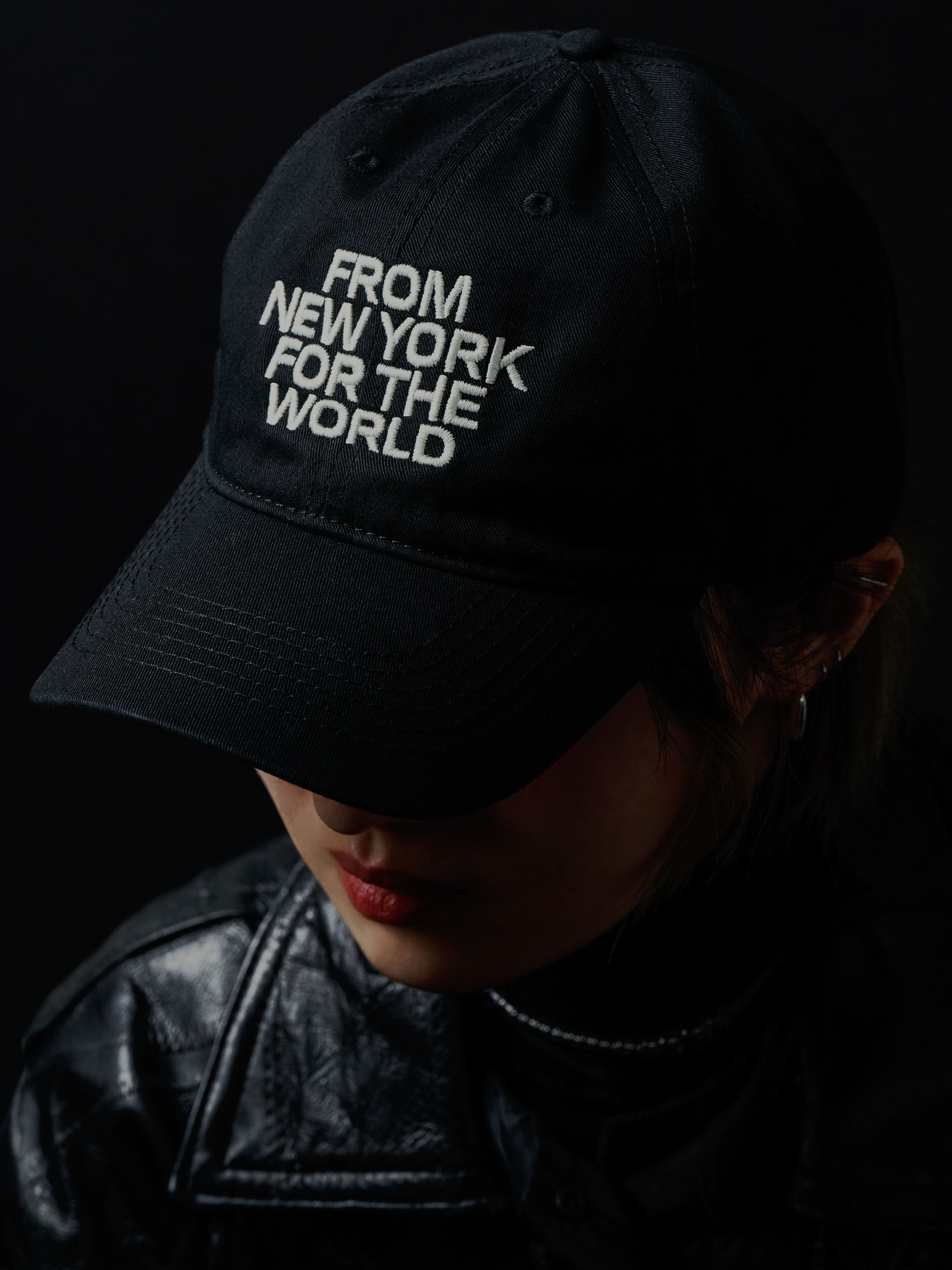
While the custom typeface and the logo serve as iconic brand gestures people will recognize, other elements like photography and color adapt seamlessly to diverse formats, programming and communication needs. Supporting the identity’s visual system is an equally flexible brand voice, personified as ‘The People’s Host’. With a fluid role in small gatherings and grand entertainment — a host warmly greets friends at the restaurant and introduces the next act to a round of applause — our voice welcomes and challenges, energizes and educates. With a straightforward structure and no added flourishes, it stays accessible to people of all ages and languages.
While each brand element has its own role to play, like any great show, the identity is more than the sum of its parts. PAC NYC opens itself up to audiences and artists, community and culture, to cement its role as a performing arts center of New York, for the world.
Credits
PORTO ROCHA
Creative Direction:
Felipe Rocha, Leo Porto
Strategy and Tone of Voice:
Natalee Ranii-Dropcho, Claren Walker
Design:
Joseph Lebus, Marek Nedelka, Natalia Oledzka
Type Design:
Marek Nedelka, AllCaps
Interactive Design:
Marcos Rodrigues, Niclas Resch
Motion Design:
Thales Muniz
Account Director:
Luciana Thiesen
Project Management:
Madeleine Golden, Samantha Cruz
Case Study Photographer:
Mari Juliano, Dino Kužnik
Case Study Production:
Annie Carmichael
Case Study Retouching:
Dino Kužnik
Type Foundry:
AllCaps
PAC NYC
Meagan Bond
Bob Pilon
Jayme Rothman
Miranda Palumbo
Building Photography: Iwan Baan