

Project Information
VEEPS is a streaming service that offers access to live and on-demand events and concerts anytime, anywhere — ensuring fans never miss a show.
Founded in 2018 by pop-punk legends Joel and Benji Madden, VEEPS has streamed thousands of performances to audiences worldwide. As the official live-streaming platform for Live Nation and Ticketmaster events, VEEPS has reached millions of viewers with iconic shows from some of the biggest names in music: Alicia Keys to Bob Dylan, Billie Eilish to Lil Wayne, Foo Fighters to Fall Out Boy.
VEEPS had passion, ambition, and strong ties to music culture — but their identity looked like any other neutral tech brand. With a respected roster and high-quality product poised to scale, they needed a brand that would allow them to show up as a leader in entertainment. Last year, we worked closely with their team on a digitally native, motion-driven identity system that does just that.
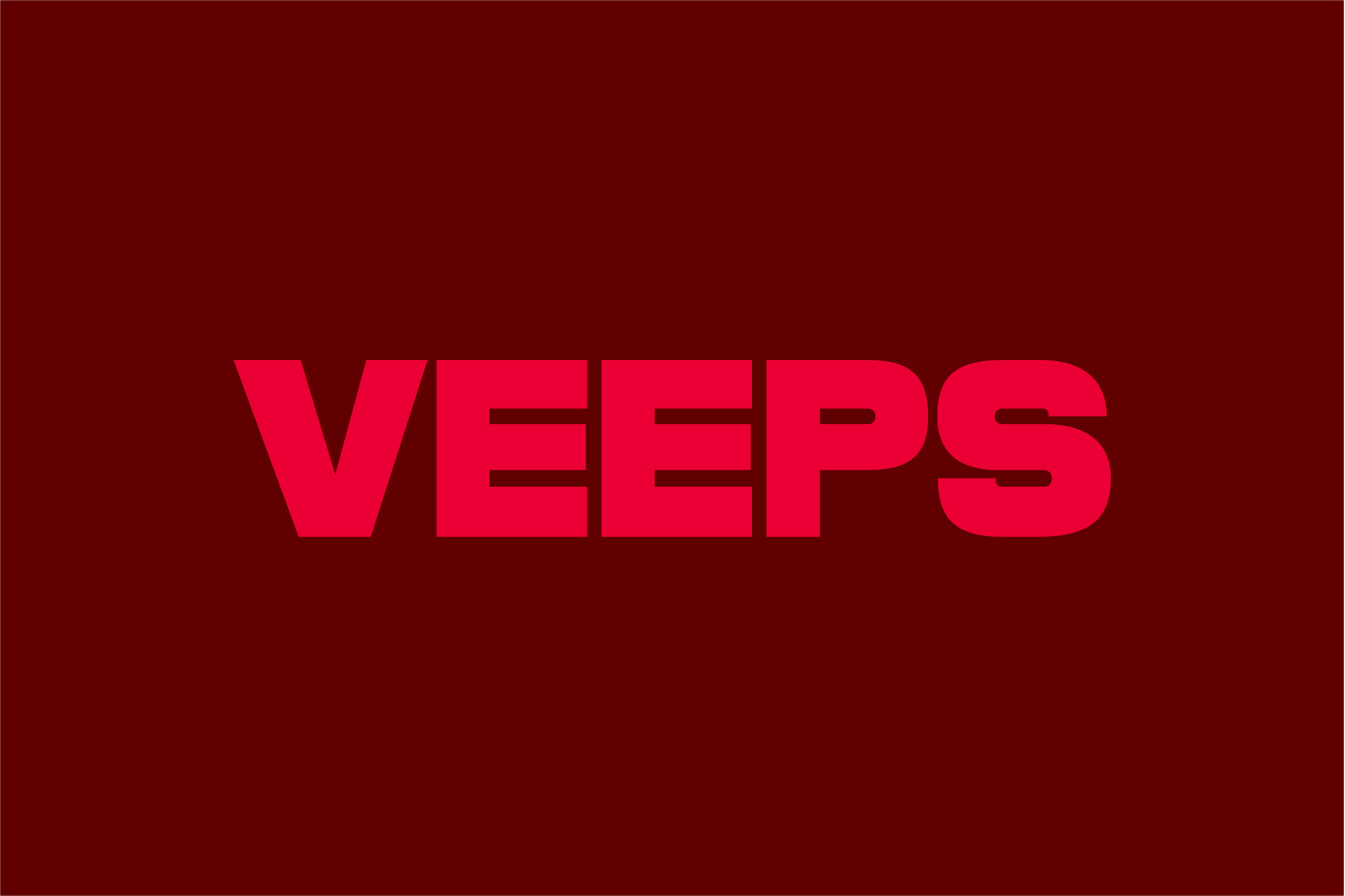
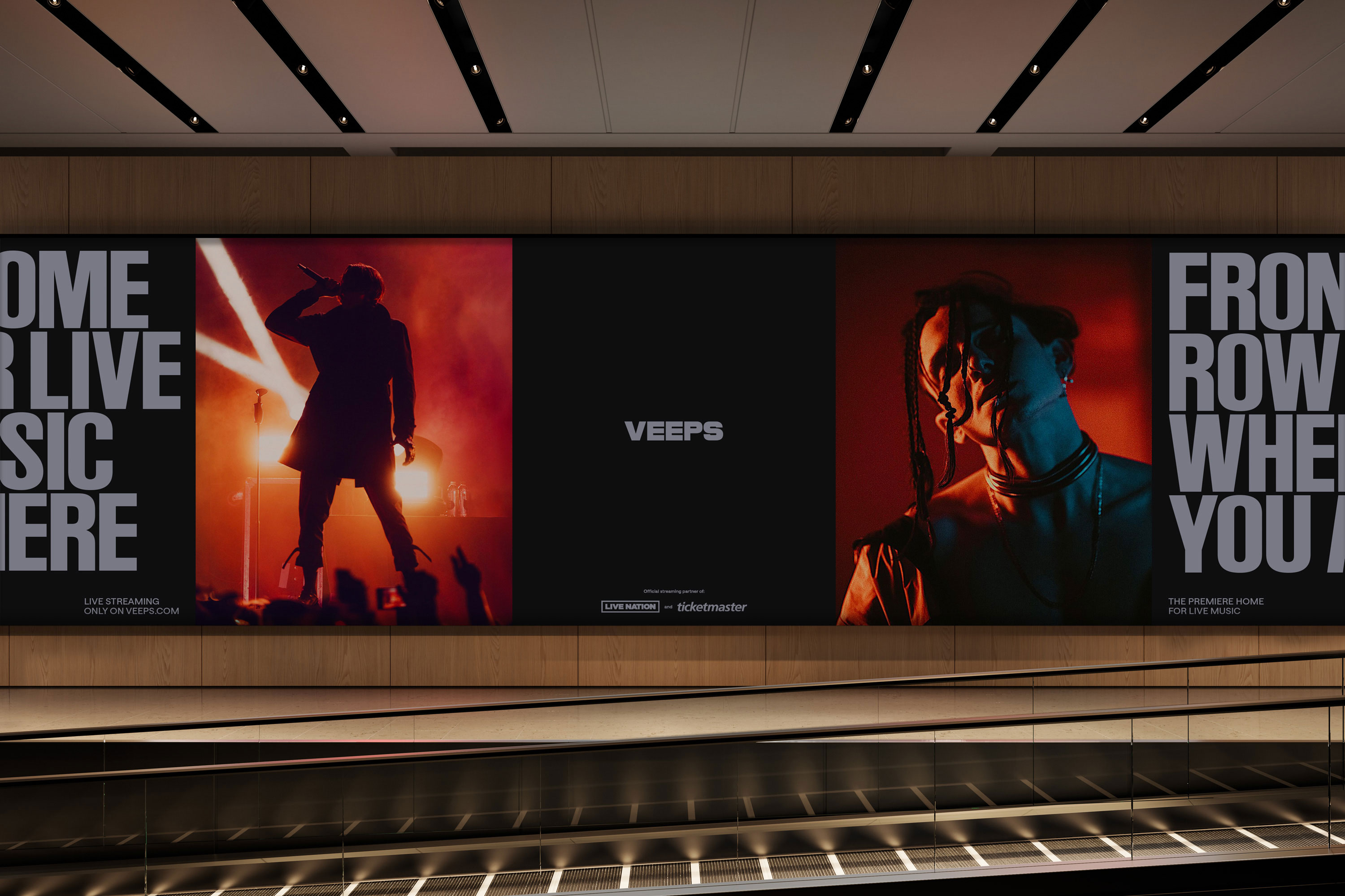
We started with a bespoke wordmark that declares VEEPS’ place in music culture. Moving away from the friendly neutrality of their previous mark, we drew inspiration from music editorial design to craft a bold, all-caps logo that packs a punch of personality — impactful in a title card and powerful even as a sign-off, simplified as a distinctive ‘V’. We then selected a combination of bright scarlet and deep crimson as signature colors: a way to bring energy to a previously black-and-white brand and a tie back to the red LIVE indicator.
While some elements command attention for VEEPS the brand, the system also flexes to let artists (and their own brand expressions) take center stage. A custom display typeface, VEEPS Ruder Plakat, was designed to fulfill both of these needs. Declarative and distinct, it brings show-stopping presence across communications and digital touchpoints alike. At the same time, it remains neutral enough to speak to many music genres and interact with a wide range of artist imagery and logos. And just like every headliner needs their road crew, our headline type needs its secondary support: the precise and utilitarian Saans.
The idea of total immersion guided our digital work in both website and product. VEEPS always films in 4K with Dolby Atmos sound — what they needed was a user interface that would live up to the quality of their streams and further immerse viewers in the show. Cinematic dark mode, ample full-bleed footage moments, and translucent in-stream UI components get viewers closer than ever to the action on the stage. We also carefully designed a live chat module so users can share the moment and react in real time with other fans. Whether you stream on a browser, Apple Vision Pro, or smart TV, the interface transports fans to the front row.
Since the rollout of the new identity, VEEPS’ engagement has more than tripled and their social following has grown by 50%. With a growing lineup of performances and product innovations around the corner, the new identity and product design will continue to solidify VEEPS’ place as a leader of their category.
Credits
PORTO ROCHA
Creative Direction:
Leo Porto
Design:
Martin Azambuja, Chae Park, Marek Nedelka
Interactive Design:
Marcos Rodrigues, Giovana Yahiro, Niclas Resch
Motion Design:
Josh Krauth-Harding
Strategy:
Claren Walker
Account Direction:
Luciana Thiesen
Project Management:
Samantha Cruz, Hamilton Yu
Developer:
ON
VEEPS
Kyle Heller
Benji Madden
Lineto
Type Designer: Anatole Couteau
Senior Sales Manager: Astrid Ramge
Displaay
CEO: Martin Vacha
Type Designer: Daniel Quisek
Studio Manager: Veronika Kralova