
The Challenge
Almeida & Dale holds the most comprehensive representation of Brazilian art under one roof, yet at that scale, the gallery had come to feel corporate and transactional — the opposite of the artist-driven culture that defines the world's most influential galleries.
The Solution
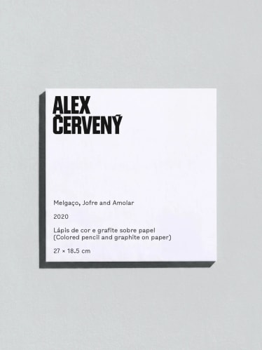
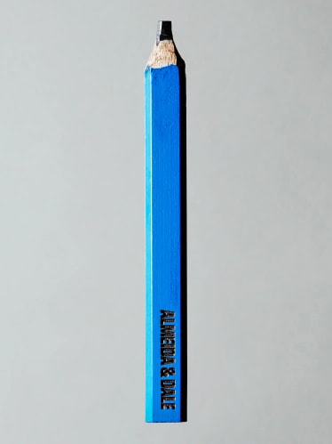
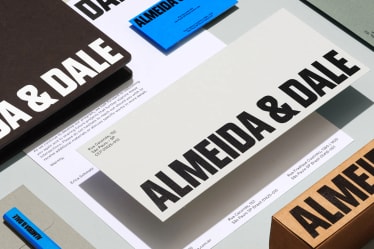
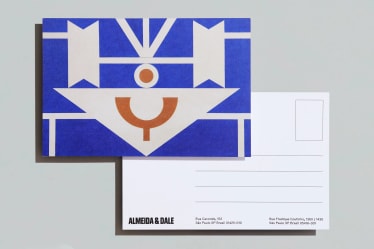
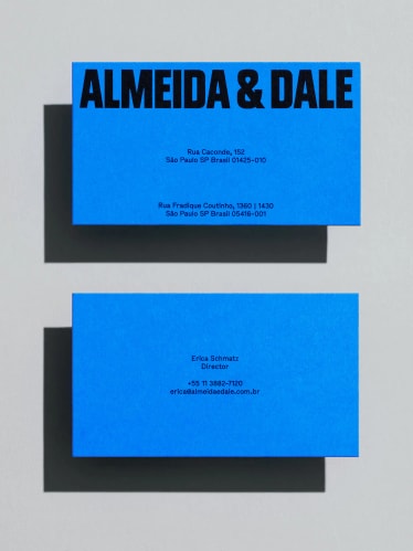
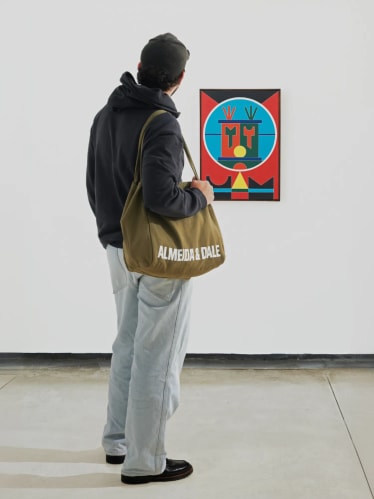
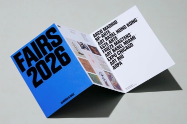
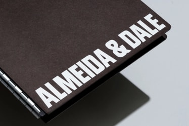
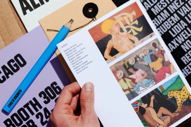
A system rooted in Brazil, ready for the global stage. Anchored by a custom typeface with distinctive diacritics, and a singular blue, the flexible editorial identity gives Almeida & Dale authority and range.
Project Information
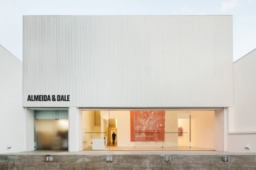
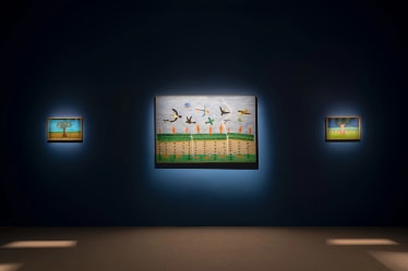
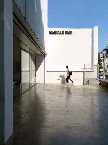
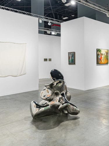
Founded in 1998, Almeida & Dale has spent over two decades organizing exhibitions, publishing books, and building the most comprehensive representation of Brazilian art under one roof. The gallery champions icons like Lygia Clark, Tarsila do Amaral, and José Leonilson alongside unique voices such as Rubem Valentim and Maria Martins. In 2025, a landmark merger with Millan (est. 1986) created Latin America's largest gallery. Together, they operate in three locations in Brazil, with a new São Paulo flagship opening in 2026.
But scale alone wasn't enough. Despite their dominance in the secondary market, Almeida & Dale had long been perceived as corporate and transactional — the opposite of the artist-driven culture that defines the most influential galleries globally. With the merger complete and a new space on the horizon, the opportunity was clear: build an identity that earns Almeida & Dale a place at that table, not just as Brazil's biggest gallery, but as a serious player in the international art world.
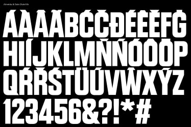
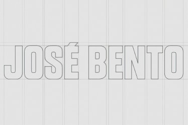
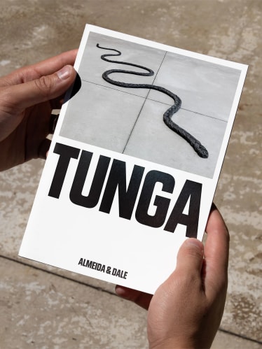
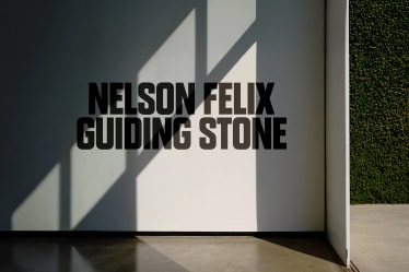
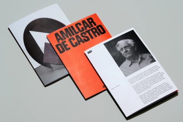
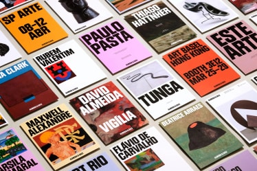
The new identity centers on Diakritik AD, a custom typeface designed exclusively for Almeida & Dale in collaboration with type designer Marek Nedelka. Combining mid-century condensed proportions with precise contemporary geometry, its bold proportions command attention without sacrificing sophistication. It was engineered specifically for Brazilian Portuguese, with diacritics drawn in the same weight as its letterforms. A secondary typeface, Bull-5, draws from typewriter-style print labels found in 1980s American newspaper archives: raw, mechanical, and full of personality. Where Diakritik commands, Bull-5 adds texture and humanity. A strong blue completes the system and signals trust. Owning a singular color is a deliberate break from the black-and-white neutrality of most blue-chip galleries, a strategy that gives Almeida & Dale a distinct presence in the landscape.
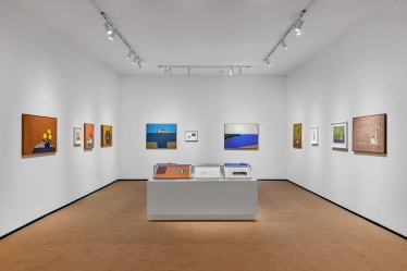
Every layout decision serves one principle: the artwork leads. The visual system is built for range—used across catalogues, fair materials, environmental signage—with full-bleed immersive moments, dynamic gridding, and flexible hierarchy throughout. Snappy motion elevates the system, making the brand feel as considered as the art it represents.
The result is an identity with the sophistication to stand alongside the world's foremost galleries and the specificity to belong only to Almeida & Dale.
PORTO ROCHA
Creative Direction:
Felipe Rocha , Leo Porto
Graphic Design:
Nathan Fyock , João Jeveaux
Interactive Design:
Marcos Rodrigues , Maya Flood , Leonardo Angelucci
Motion Design:
Thales Muniz , Charles Carlos
3D Design:
Pedro Veneziano
Operations Director:
Luciana Thiesen
Project Management:
Elisa Bortolini
Partners
Client:
Almeida & Dale
Strategy:
Marte & Mercurio
Web Development:
Fluxo Design
Type Foundries
Marek Nedelka , Tightype
Case Study Production
Graphic Design:
Nathan Fyock , João Jeveaux , Etienne Murphy
Interactive Design:
Marcos Rodrigues , Clémence Guillemot
Motion Design:
Thales Muniz , Nabill Parvizi
Copy:
Claren Walker
Project Management:
Elisa Bortolini
Case Study Photography:
Mari Juliano , Naira Mattia
Photoshoot Production:
Annie Carmichael