
The Challenge
Tinder revolutionized modern dating, pioneering the swipe and ushering a new era of connection. But, after more than a decade and an influx of new competitors, Tinder had fallen behind in the category it pioneered and come to be seen as a hook-up app, especially among the Gen Z audience they wanted to reach.
The Solution
Possibility is the point.
Position Tinder as the place where freedom is the focus, where contradictions are welcome, and possibility burns bright. Whether you're figuring out your type, questioning your sexuality, or seeing who crosses your path, Tinder gives you an unfiltered way to try something new with someone new.
The Flame Burns Brighter
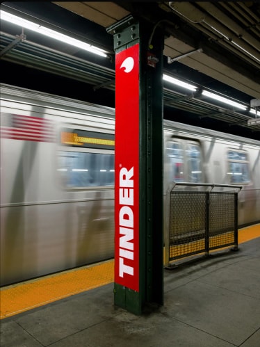
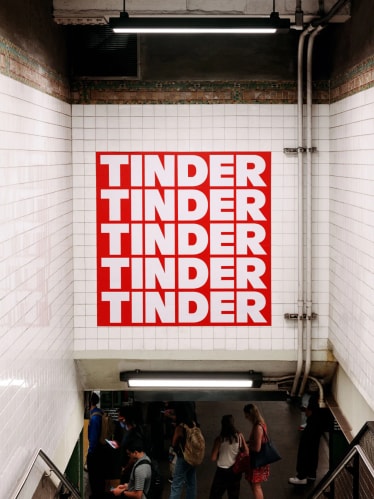
Rooted in Tinder’s legacy yet evolved for impact, we designed a bold, all-caps wordmark to carry an unmistakable presence across every touchpoint. Its strength and simplicity signal scale and self-assurance, reinforcing Tinder’s position as a category leader while helping it stand apart from its competitors.
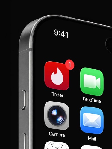
Tinder’s flame is one the most iconic and recognizable symbols in the world of online dating. We refined its proportions and sharpened details against the overall curvature to create a subtle but exciting sense of tension throughout.

Turning Up the Heat
Our color system represents a spectrum of feelings that accompany a new connection, reflecting a range of heat in a palette that’s vibrant, approachable, and slightly analog. At its core is Flame, a heroic, energetic, and unmistakable red. Surrounding it is a dynamic range of supporting hues, designed to flex across contexts while maintaining a cohesive, spirited identity.

A Perfect Match
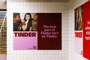
Our typographic system pairs editorial expression with technical precision. It leads with Society by AllCaps, a sassy serif that brings narrative depth, flirty flair, and a subtle sass to the brand. In select moments, its rendered in italics to bring an extra wink to our voice.
FT Regola provides a grounded, technical counterpart. Its considered construction and geometric proportions anchor the system, working to ensure scalability across product and technical applications.
Together, they create a typographic system that’s as emotive as it is exact.

It Started With the Swipe
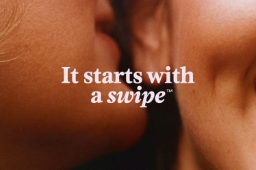
For Tinder’s motion language, we built upon the gesture it pioneered: the swipe. Elements move, enter, and transition across applications with an ease and familiarity that is immediately recognizable. Typography works in tandem, revealing and shifting through subtle and typewriter-style movements to signal exploration and the human touch.

Candy-Coated Charm
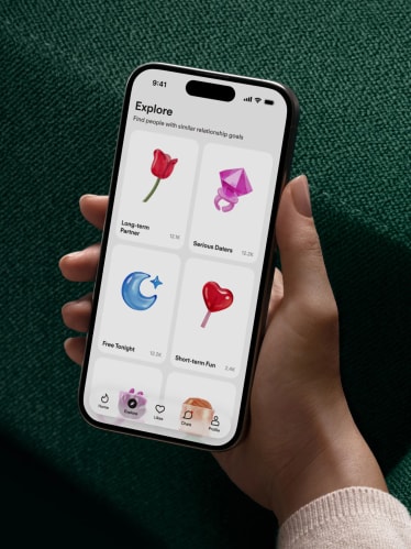
Our illustration system builds on the graphic, pop sensibility of our still-life imagery, reimagining familiar forms in unexpected ways. Playful, tactile, and a little cheeky, it brings a sense of lightness and surprise in product, digital, and social.

Xo, T
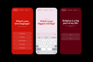
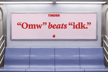
Inspired by a dating columnist, our voice blends cultural savvy, razor-sharp wit, and the empathy of someone who’s been there before. They aren’t afraid to drop a hot take and keep you from spiraling in a sea of double texts and soft launches. In a time where dating feels like all or nothing, T lowers the pressure so you can explore for the fun of it.



Project Information
Tinder revolutionized modern dating, pioneering the swipe and ushering in a new era of connection. But, after more than a decade and an influx of new competitors, Tinder had fallen behind in the category it pioneered and come to be seen as a hook-up app, especially among the Gen Z audience they wanted to reach.
As a new generation reshapes what connection looks like, Tinder needed to reignite its flame to reclaim its place as the most fun place to spark something new with someone new, especially for women seeking a sense of safety and control in their experience.
At the heart of this shift was a dating landscape full of contradictions — craving both freedom and intention, exploration and meaning. While other platforms push people to choose a side or reduce dating to a single path, we saw the opportunity to embrace the many facets that make us unique.
We positioned Tinder as a space where possibility is the point. In a category focused on finding the one, we built a confident, flirty brand that celebrates the ones along the way. Whether you’re figuring out your type, questioning your sexuality, or seeing who crosses your path, Tinder is where you can explore freely and have fun.
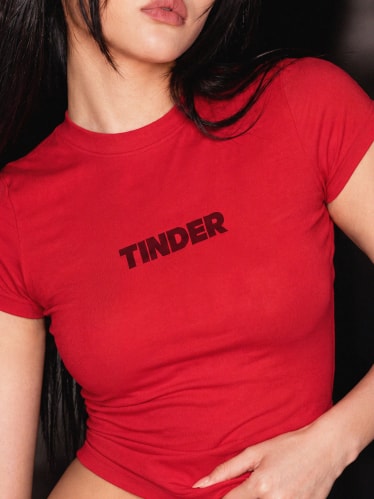
Rooted in Tinder’s legacy, we designed a bold, all-caps wordmark to carry an unmistakable presence across every touchpoint. Its strength and simplicity signal scale and self-assurance, reinforcing Tinder’s position as a category-leader and defining cultural force.
We applied the same thinking in our evolution of Tinder’s flame symbol. The Tinder flame stands as one of the most recognizable marks in the world of online dating — and retaining this was crucial. Holding on to its core character, we delivered a refined symbol with a contemporary edge; one that’s more agile, sharp, and assertive in Tinder’s competitive category.
Tinder’s new icons were built on a geometric framework, combining sharp line work with controlled curves. Consistent stroke weights, corner treatment, and alignments ensure cohesion, while the system remains flexible enough to support a wide range of use cases harmoniously.
Our verbal identity reimagines a familiar figure from dating’s editorial heyday: the dating columnist. Blending cultural savvy, razor-sharp wit, and the empathy of someone who’s been there before, T is both confidante and commentator, equal parts insight and instinct. Like Carrie Bradshaw for a new generation, T isn’t afraid to drop a hot take or give you the nudge you needed if it means opening you up to what’s possible.
T comes to life through a typographic system combining editorial expression with technical precision. It leads with Society by AllCaps, a contemporary serif that brings narrative depth, warmth, and a subtle sense of flirtation to the brand, while FT Regola provides a grounded, technical counterpart.
In color, we took inspiration from the heat at the core of connection. Conceived as a spectrum of emotions, we translated temperature into a palette that’s vibrant, approachable, and slightly analog. At its core is Flame, a heroic, energetic, and unmistakable red. Surrounding it is a dynamic range of supporting hues, designed to flex across contexts while maintaining a cohesive, spirited identity.
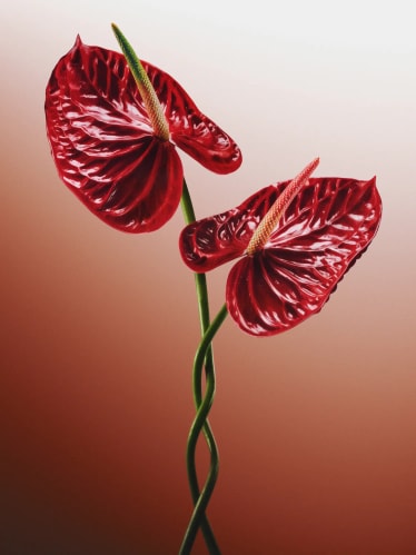
Imagery flows between candid realism and expressive symbolism to reflect the full range of possibilities on Tinder. Ranging from daters IRL, into imaginative metaphors and repurposed cultural symbols, we balance authentic intimacy and impactful visual storytelling. Together, they reflect a world where connection isn’t singular or scripted, but dynamic, expressive, and endlessly in motion.
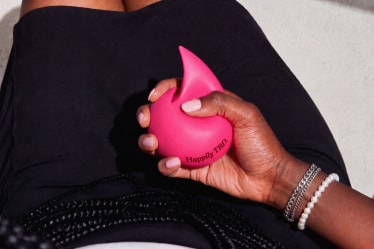
Our illustration system builds on the graphic, pop sensibility of our still-life imagery, reimagining familiar forms in unexpected ways. Playful, tactile, and a little cheeky, it brings a sense of lightness and surprise in product, digital, and social — offering depth and immersion in even the most marginal moments.
Lastly, we built Tinder’s motion language upon the gesture it pioneered: the swipe. Elements move, enter, and transition across applications with an ease and familiarity that is immediately recognizable. Animated typography works in tandem, revealing and shifting through subtle and typewriter-style movements to signal exploration and the human touch.
Every element of the brand connects in Tinder’s most prominent touchpoint: the app itself. Our identity shapes Tinder’s new UI system, both directing how it looks and functions. Serving as a backdrop, the UI allows people, photography, and user personality to take center stage. Familiar moments like swiping and matching are made more expressive and distinctly Tinder, while serif typography, interactions, and color bring warmth to a highly-digital category. Color then flexes even further within the app, illustrating different themes and moods to make the user experience more contextual and responsive.
Built on the idea that possibility is the point, our new identity embraces all of the uncertainty, excitement, and potential at the heart of modern connection. We set out to reconnect Tinder with the spark that made it a category leader, and redefine that spark for a new generation — and it seems to be working. Our new identity marks an inflection point for Tinder, with Q2 reports showing soaring in-app match growth — doubling the previous quarter’s — and Tinder’s best performance in year-over-year daily active users in over three years.
PORTO ROCHA
Creative Direction:
Felipe Rocha , Leo Porto
Design:
Gabriela Carnabuci , Yedo Han , Olivia Chan , Jordy Kuster
Motion Design:
Thales Muniz , Josh Krauth-Harding , Nabill Parvizi
Interactive Design:
Marcos Rodrigues , Maya Flood
Strategy:
Natalee Ranii Dropcho , Claren Walker , Nick Drain , Peggy Nyamekye
Project Management:
Natalie Kilic
Tinder
Head of Product Design:
Chamal Samaranayake
Senior Director of Product Design:
Newar Al Majid
Principal Visual Designer:
Yu Lu
Director of Global Brand Strategy:
Emily Dods
Case Study Production
Design:
Jean Wojciechowski
Interactive Design:
Pedro Meireis
Fonts
Society - AllCaps
FT Regola - Formula Type